Manhattan interior designer Elena Frampton prides herself on striking a balance, be it with color, texture, or the eccentric design details she likes to refer to as "moments."
For a Westchester County couple who purchased a pied-à-terre in the tony enclave of Sutton Place, Frampton’s mission was to "create a sense of spaciousness" from the kitchen that extends to the bedroom.
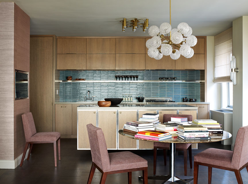
A lighter, brighter kitchen
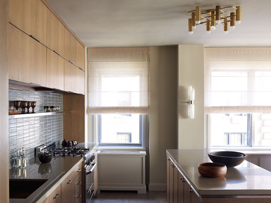
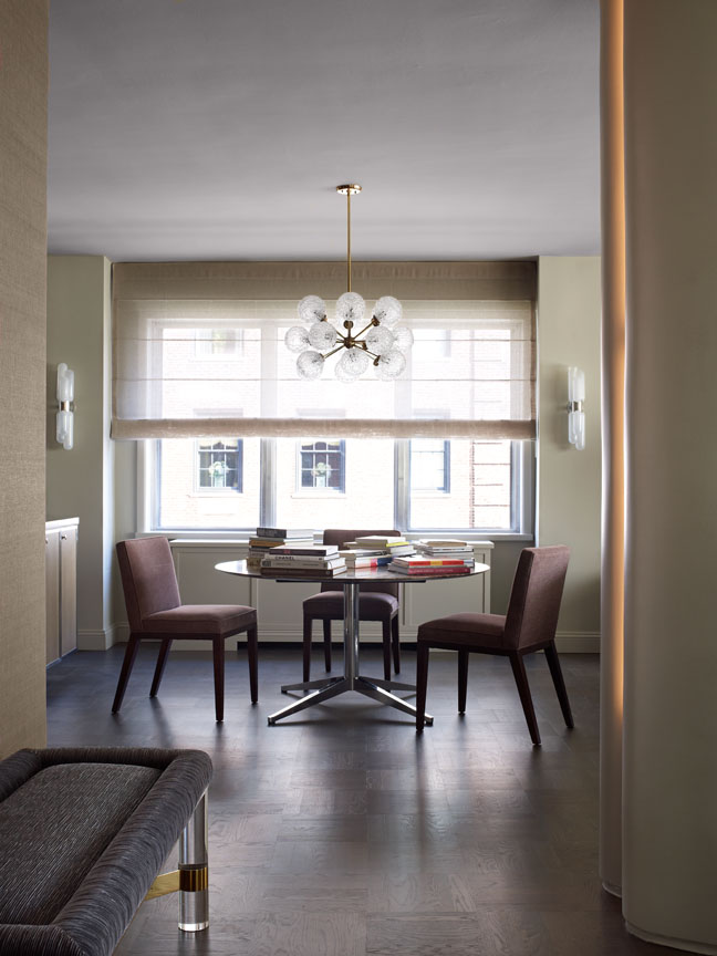
No stranger to gut renovations, Frampton eagerly tore down the kitchen wall to "create an elegant space that would be open," she says. Then she added an island that serves as a dining room sideboard.
Ceiling-high cabinets in a medium oak were selected for their "cleaner geometry," Frampton continues, while sky-blue tiles were chosen for color. "I love bringing color and texture into a kitchen," she says.
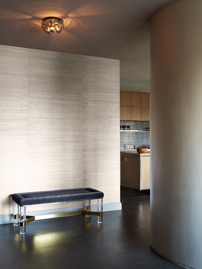
A square column that leads to the living room was rounded to make it more of a "sculptural element," Frampton says, rather than something obtrusive. "When we encounter something that appears to be a conflict, we ask, 'What can we do to make it something interesting and appealing?'"
In the same vein, Frampton selected a variety of eye-catching light fixtures. "I love bringing personality to spaces with sculptural, interesting items," she says, noting the surface-mount fixture and chandelier, both in the kitchen, that were made in the ’60s and ’70s.
"It's really about having fixtures and finishes that are elegant and suitable for an open living environment."
Spacious tricks for open living spaces
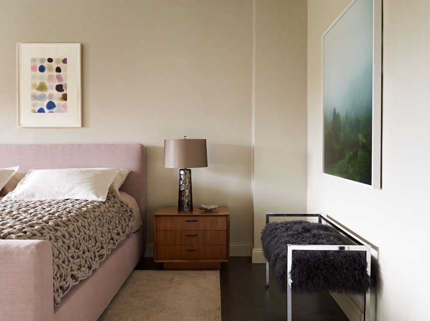
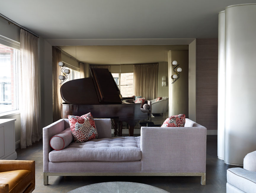
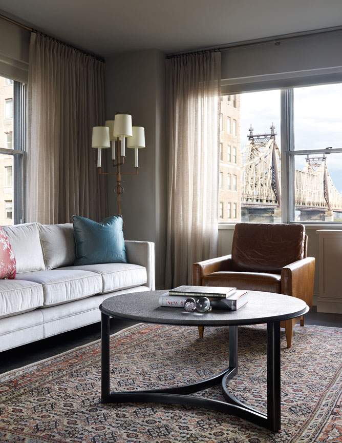
Mixing materials was also important when it came to the textiles. A brown leather couch makes a statement in a living room defined by beiges and grays, while a chunky knit blanket adds a touch of whimsy to an otherwise serene master bedroom.
"It doesn't feel too beige, and it doesn't feel too gray," Frampton says of the bedroom's palette, which is enhanced by art from Sears-Peyton Gallery in Chelsea, New York. The light on the nightstand is from Orange in Los Angeles.
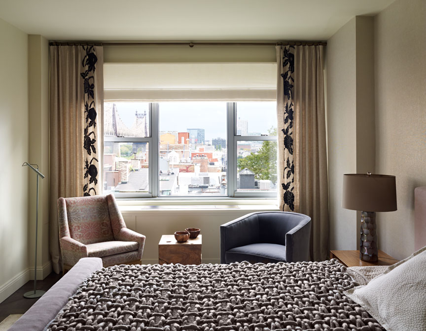
For Frampton, the biggest challenge was creating a sense of spaciousness in an apartment that felt closed off. "The windows are not large," she says, "and the ceiling height is the standard eight feet."
To get around the problem, she used several wall-mounted lights, which take up little space, and painted the ceilings a shade lighter than the walls. "It makes rooms feel larger," she notes.
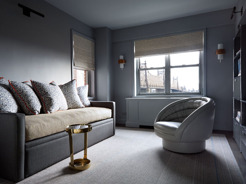
Back in the living room, a tinted mirror with an architectural frame was added to reflect the stunning view of the 59th Street Bridge outside.
Frampton also took risks where she could afford them, as evidenced by a fur-covered bench in the bedroom. Going back to the idea of balance, she says, "It's more about calibrating choices than tempering all of them." In other words, she carefully chose what she wanted to stand out.
"If art is your thing, or whatever it is that gives you joy, that's the area to take risks," she says. "It's not about whether it's trendy or if your friends like it. What are the things that bring you joy?"
Get the look at home
Follow Frampton's tips to get a tailored look in your own home.
- Choose your moment. "Here, we decided to go vintage with light fixtures, but it could also be hardware or dining chairs," Frampton says. "Pick a moment, and find the right thing to focus on.”
- Vary the palette. To make the bedroom's beige walls feel more of the moment, Frampton says, "We brought in art, and the art brings a lot to the story." It's also helpful to layer beiges and grays for a balance of warm and cool effects. "Mixing brings some complexity to the palette, even though it's neutral."
- Always test the paint colors. "We test paint colors on-site to look at them in different lighting conditions," Frampton says. She also likes to sample "four or five neutrals on a wall."
- Go a shade lighter on the ceiling. "We do our ceilings in the same shade as the walls, but one hue lighter so it all looks the same," Frampton says. "A ceiling inherently has shadows, so going one shade lighter makes it look uniform."
Photography by Joshua McHugh
Related:
;)