Editor’s note: Color authority Pantone just announced its selection for the 2018 Color of the Year: Ultra Violet, a purple shade that is sure to prompt passionate discussion among design pros and enthusiasts. Leatrice Eiseman, executive director of the Pantone Color Institute, says the color “communicates originality, ingenuity and visionary thinking.” 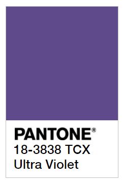
We spoke with Eiseman about how her team selects the color of the year, and some of the color trends that will influence home decor in 2018.
Pantone's annual Color of the Year selection makes an impact on the home and interiors industry - often in ways the average consumer isn’t even aware of.
For example, Pantone's 2016 selection Rose Quartz paved the way for Millennial Pink, a blush hue that made headlines in 2017 thanks to its ubiquity in packaging, logos, and products - particularly those targeted to young female consumers.
"That [selection] really created a spike," says Leatrice Eiseman, executive director of the Pantone Color Institute and author of the recently released book “The Complete Color Harmony: Pantone Edition.”
"Pink just went everywhere,” she continues. “It went viral." Pantone chose the shade because it was reminiscent of rosy cheeks and good health.
Rose Quartz shared the 2016 Color of the Year designation with sister shade Serenity, a soft blue. The delicate colors were chosen for a balance between warm and cool, and to show that pink and blue are no longer gender specific.

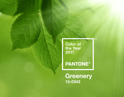
Pantone proclaimed its 2017 choice, Greenery, a symbol of new beginnings, and “illustrative of flourishing foliage and the lushness of the great outdoors.” This year, perhaps influenced by Greenery, Gen Z Yellow and other vibrant sunny hues have been seen in the home and on the fashion runways.
"Vibrant yellow has captured attention because in every society, yellow is sunlight. It means warmth, an enveloping presence, and it makes you happy. It's a feel-good color," says Eiseman.
Trends for 2018
Next year, in addition to Ultra Violet, expect to see a new, exciting spectrum of colors in the interior design world. Pantone's 2018 home and interiors color palettes include Playful, an array of "lollipop colors" that are perfect for a cheery kids' room.
On the other end of the spectrum there is Discretion, which feature natural hues and nuanced neutrals, and the Verdure palette’s quieter shades in the green and blue family.
Eiseman also notes a newfound interest in neutrals. Beyond shades like gray, beige, off-white, camel and taupe, a new, exciting category of colors is making its way into the design world. New neutrals like "greige" (gray-beige) and blush are fun new options for the person who wants a neutral that has a little personality to it.
"Neutrals started out in a very basic place," says Eiseman. "When you add undertones to neutrals it can be affective and sophisticated. You can add a mauve tone to gray so it's rosy, not dull and flat."
Eiseman also recommends embracing the natural world and using neutrals that incorporate green tones.
Since 1999, when Pantone started selecting a Color of the Year, the interest in color forecasting has grown dramatically. "It's just so interesting the way people respond to it," says Eiseman. "It really proves how exciting the subject of color it is - whether you're a designer or someone who simply loves getting a conversation going about color. It helps to unleash creativity."
Signals from many sources
From 2016's delicate pink and blue to 2017's invigorating Greenery, color trends have dramatically shifted just in a year. So how does Pantone make its predictions about what the next big thing will be?
From art exhibits to animated movies, each year design elements from around the world guide Pantone as they forecast color trends for the year ahead.
"Our team at Pantone is well-traveled,” Eiseman. “We go to trade shows in Paris and Milan, and while we’re there we stay in the Design District, so we get a real sense of what is in stores, worn on the street, what exhibits are being shown - and then we start to connect dots."
In the art world, Pantone stays abreast of current exhibits for artists like David Hockney and Yayoi Kusama, along with the colors that appear in their work.
"These shows travel the world and get the buzz out and people start talking about [the art] and the way color is used," Eiseman says. "This also enters into our thinking when we are creating a forecast. Yayoi uses bright colors and polka dots, and Hockney uses saturated colors for the most part."
Eiseman also mentions big worldwide events like the Olympic Games and international auto shows in Los Angeles and Geneva as places where Pantone observes the interplay of hues. "These are indicators of the future," she says.
Using color in your home
When selecting color for your home, many factors come into play. Here Eiseman gives her pro tips on infusing your abode with the right hues.
- Inside the home, don't be afraid of defying tradition. "You create your fantasy on the inside of your home," says Eiseman. For instance, Eiseman lives in the gray Pacific Northwest, so she painted her walls in a sunny yellow to evoke a happy mood and the illusion of sun.
- For your home’s exterior, choose subtle colors. Eiseman warns that painting your home an attention-grabbing color like purple could rub people the wrong way. If you love vibrant colors, paint your front door a bold hue or incorporate bright colors in your pots and plantings.
- Decide on your comfort level. "What do you want your house to feel like?" asks Eiseman. "Figure out what you want your house to represent." If you want solitude, go with a calming color palette. Or if you love bold color, go all out. Each color sends a different message and evokes a different mood.
- Set the mood. For a soothing environment, choose quiet colors like Pantone's Angora White or Dove Gray. For a tinge of warmth, go with Rose Water Pink or Almond Oil. Cooler neutrals include sea spray greens, dew-touched blues or a frosty lavender. Eiseman warns to not exclusively decorate with cool hues, as it can create a cold atmosphere.
- Create balance. For someone who wants a more "provocative palette," Eiseman recommends seductive hues like spicy reds, hot pinks and succulent oranges - but not exclusively. To ground the vibrant colors and balance out the warmth, she recommends adding a rich chocolate, black or peacock blue.
What do you think of 2018’s Color of the Year?
Related:
;)