The mission was simple: Transform a run-down 1930s Los Feliz, CA craftsman into a modern-day dream home fit for a young family.
Los Angeles interior designer Ryan White was up for the challenge, especially because he agreed with developers Jamie Davis and Jonathan Nash of W One Properties that the house should retain its old-fashioned charm.
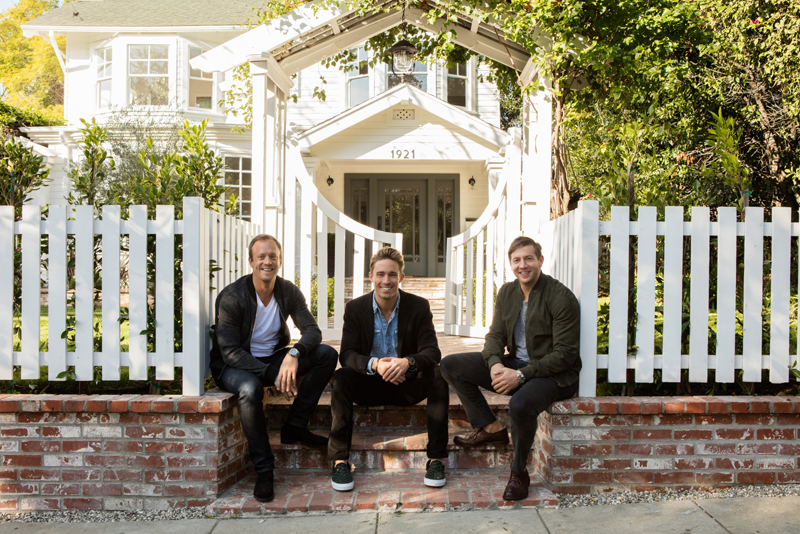
"Let's make sure we make it feel really authentic and not super-developed," White recalls the pair saying. They envisioned a home "that still had the old bones" but reflects "the way we all like to live today."
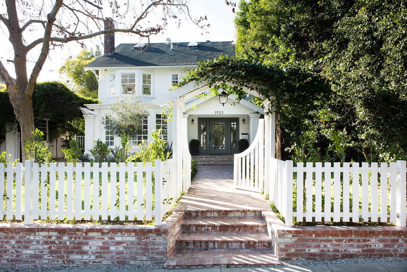
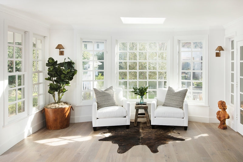
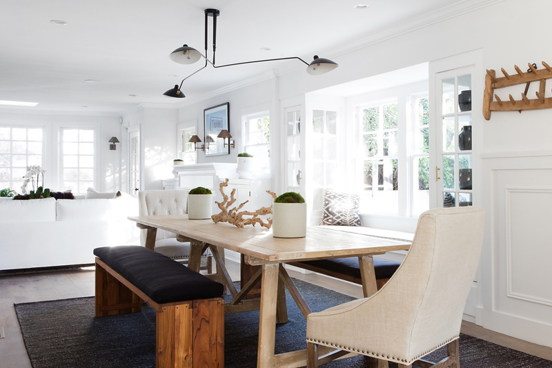
When you set foot in the home at 1921 N. Hobart, it's clear White understood their request. Although there were no moldings in the home originally, he decided to bring some in "to give a little bit of a nod to an older, more refined style," he says.
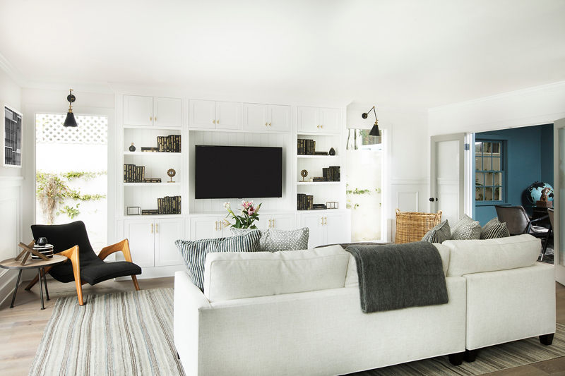
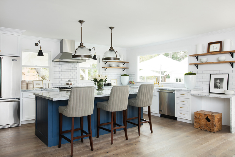
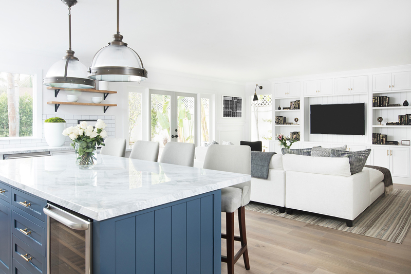
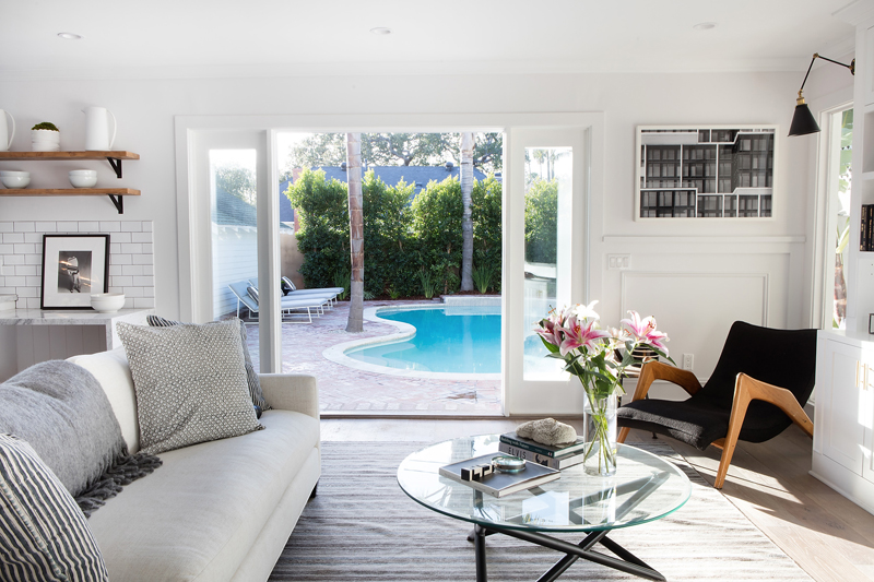
Wide-plank wood floors are also new additions, along with black iron banisters - a "nod to what you're going to expect for the rest of the home." The white paint was an obvious choice, he adds, as the low ceilings dictated he keep things as open as possible.
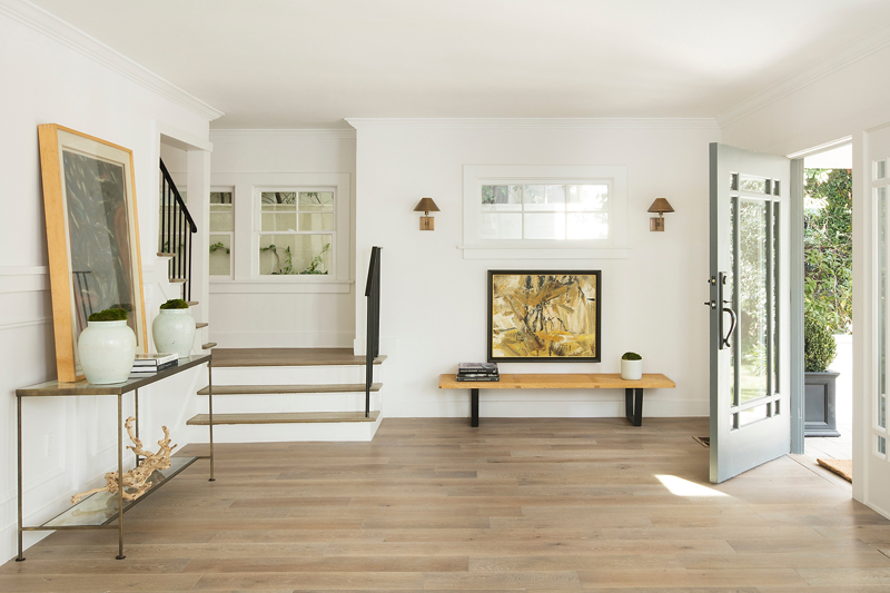
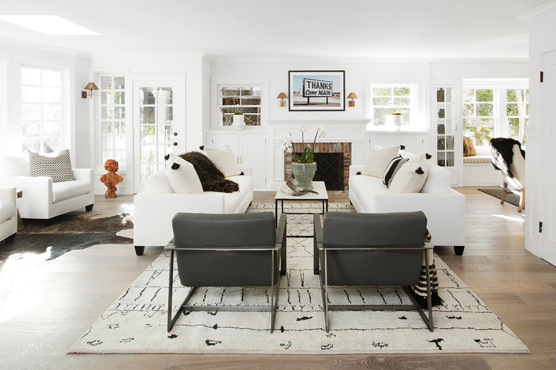
To maintain the old-school vibe, White added build-in shelves to the all-white living room; a linen closet was salvaged with the help of talented carpenters, who replaced the broken fittings and tracking.
After stripping the cabinets down to their raw wood, they were painted a thin coat of grayish green, which "nods to the English tradition of being crisp and clean and handsome," White says.
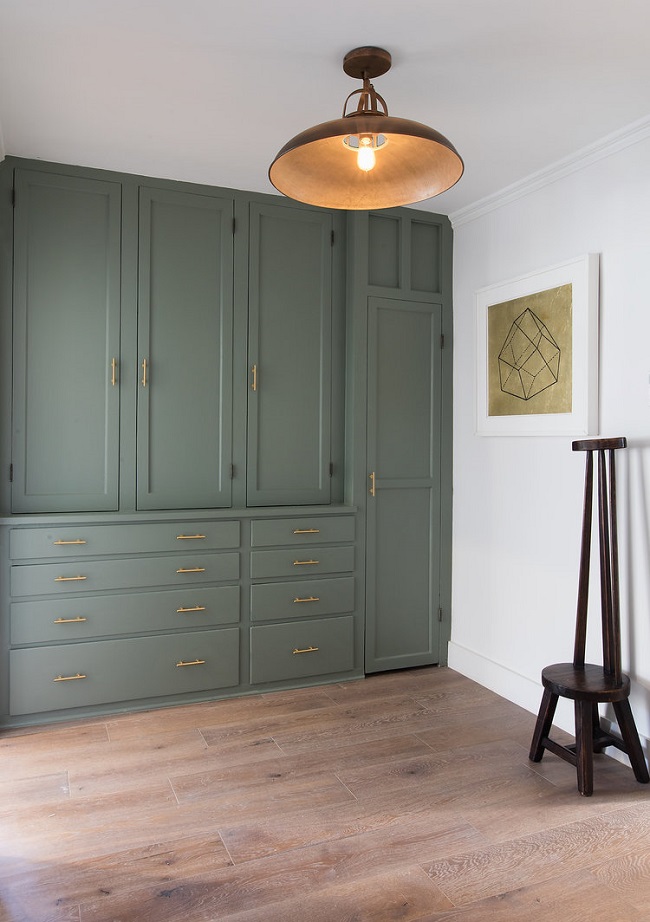
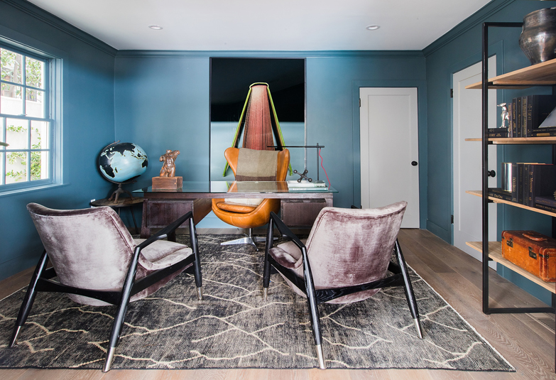
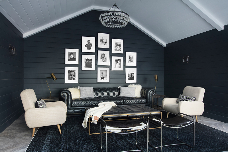
He cites the U.K.'s Soho House as an inspiration, where the muted colors, seen in the powder room and study, would make future homeowners "feel like they're in their own private club."
Considering the house hadn't been touched in decades and "looked like a crazy lady with 16 cats had lived there for 50 years," White jokes, that's saying something. "I remember walking in and being like, 'Is this going to come together?'
"The house was essentially brought down to its studs and gutted to open the rooms,” he adds.
Transformation complete
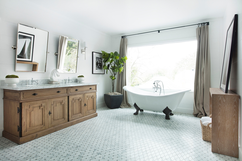
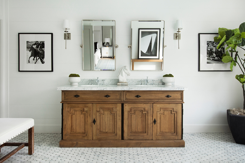
Today, 1921 N. Hobart boasts truly desirable amenities that a growing young family would ask for. The palatial master bathroom "feels like an oasis," White says, thanks to an expanded marble shower, white clawfoot tub and vintage vanity.
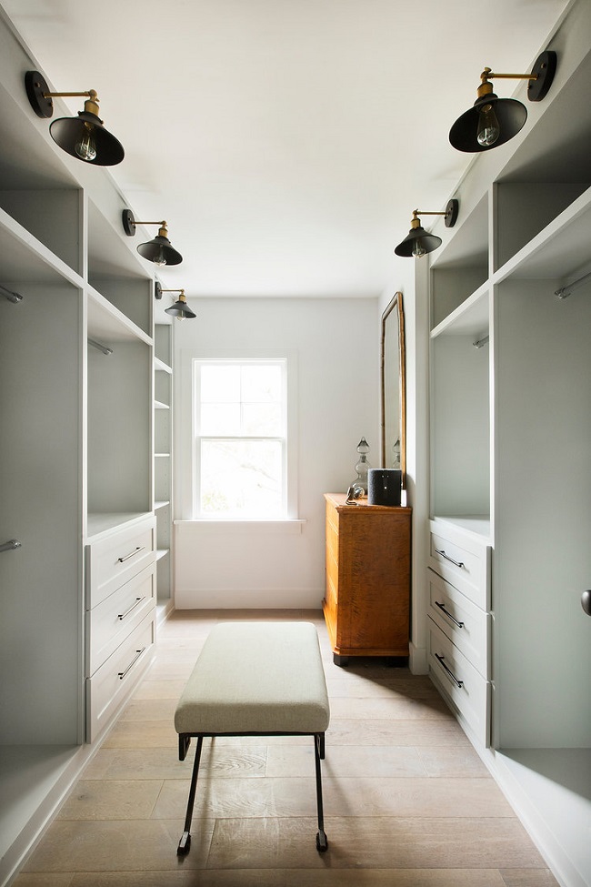
In the double closets, another with-it addition, sconces were added to make it feel "like you're walking into a high-end department store."
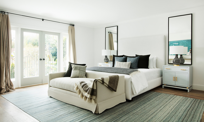
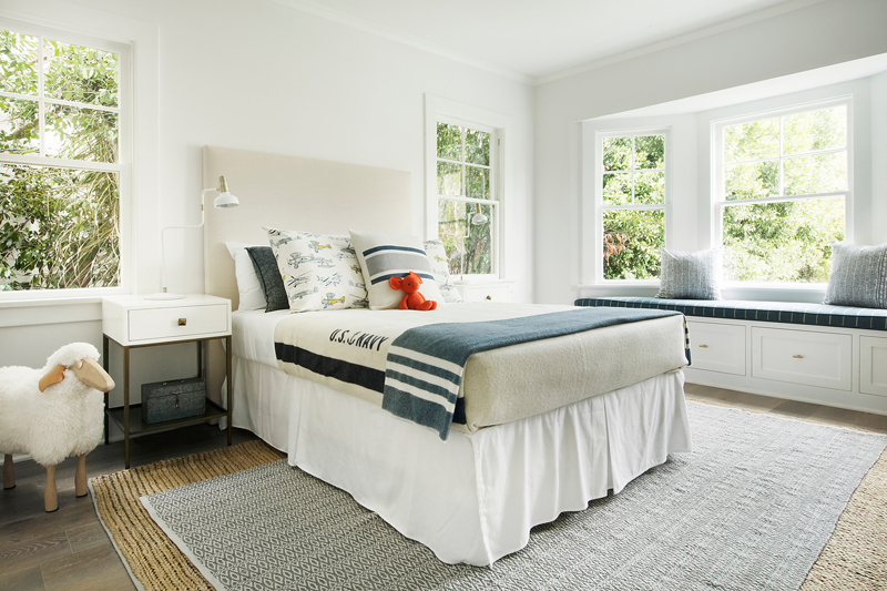
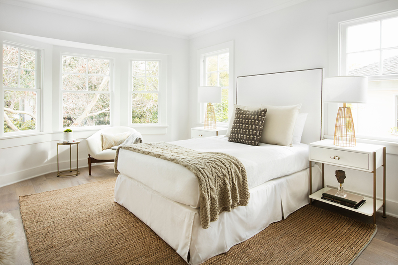
However, the airy all-white bedrooms are where old and new harmonize best. There, you'll find custom cabinets and benches that beckon you to take in the view.
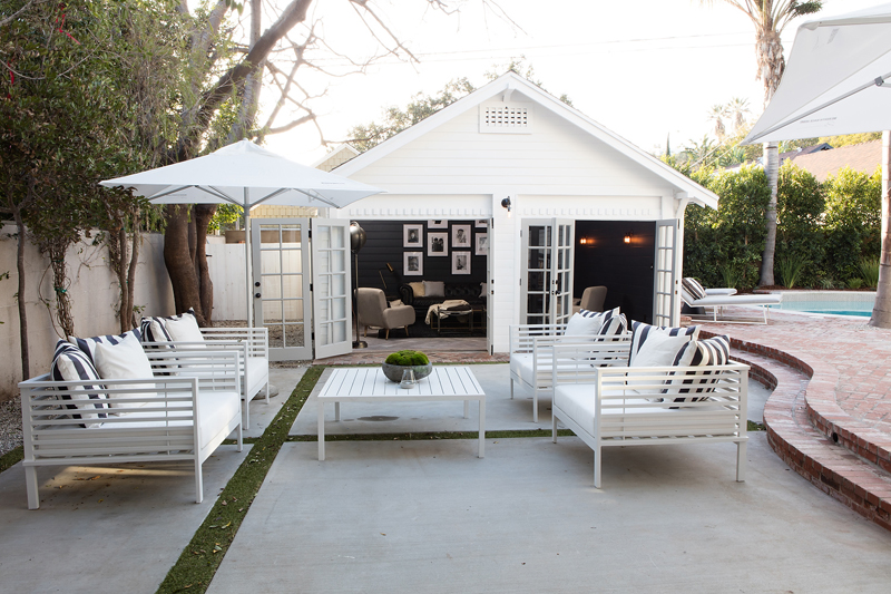
Take the full tour:
Get the look
Inspired by White’s design? Here are a few tips for achieving a similar look in your own home’s upgrade.
Keep the character
"When you've decided what really makes the house shine, then you add in modern amenities," White says. "I see way too many houses where people come through and completely gut it."
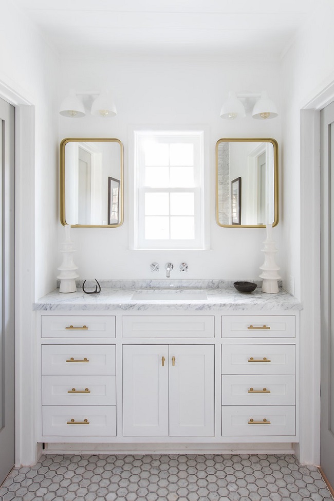
Splurge on plumbing and fixtures
"I really do love adding in great plumbing and fixtures, whether it's the lighting or sink," White says. "Having those type of moments in a home … makes it feel a bit more creative."
Start simple
In the powder room, it's easy to express your creativity, White says.
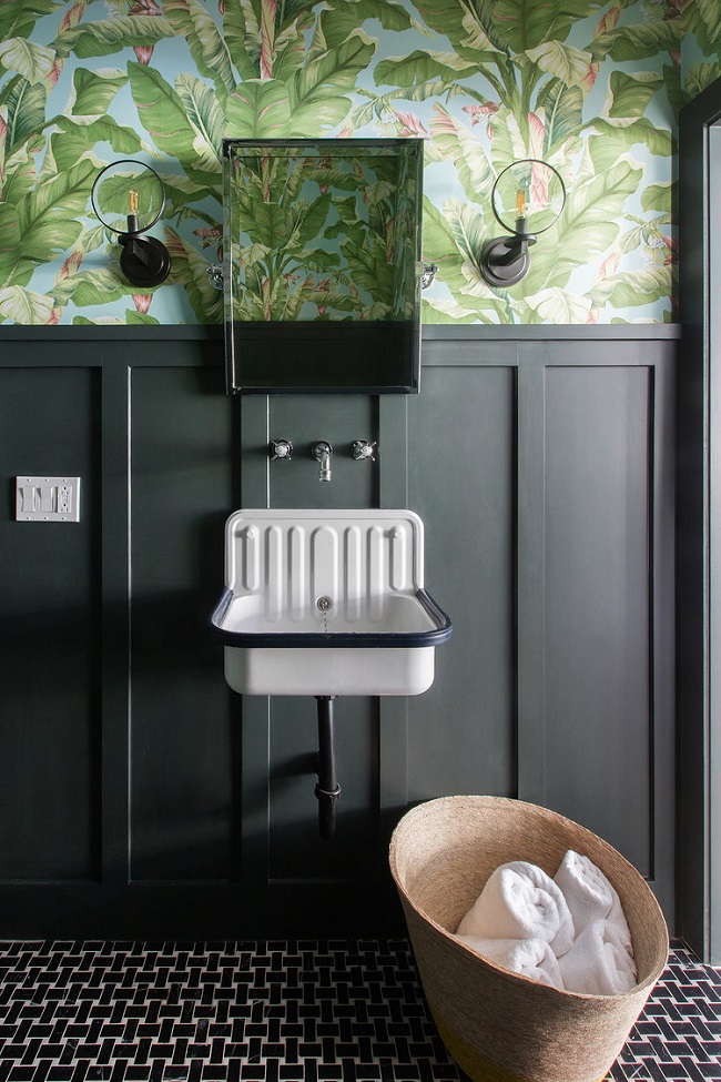
Try to "start off on a tailored level, keep it smart and then add the freak flag at the end." But you don't want to overwhelm the small space.
Photos by Stephen Busken
Related:
- Designer Lookbook: Kari Whitman Uses Metal to Create a High-Style Look
- How to Build a Home Renovation Team You Can Trust
- Home Design Quiz: Would You Rather … ?