A couple with two young kids tapped Richmond, VA interior designer and architect Kristi Lane of Visible Proof to transform their small, segmented kitchen, breakfast nook, and dining room into functional and flowing spaces for their daily family gatherings.
"The part of the home they were spending most of their time in needed renovating," says Lane. "They had the space and square footage, but it just wasn't functional."
The stately 1930s Georgian home in Richmond's Southside neighborhood possessed great curb appeal and bones, but the kitchen and dining areas weren't cutting it for the homeowners. The original kitchen had nice finishes and appliances, but the space was dark and dysfunctional.
"Only one person could be in the kitchen," says Lane, "People don't live like that." The kitchen was also the main entry point for the home, which didn't bode well for traffic flow.
The homeowners requested bright, happy, and fun spaces that were also simple and streamlined. They were prepared to knock down walls, and enlarge doorways and windows.
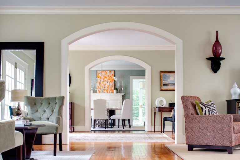
"Opening up the walls allows you to see through the entire house, which added more light in the middle of their home," says Lane. The dining room, kitchen, and breakfast nook/mudroom transformed into three distinct spaces, and a reconfigured layout and larger doorways allowed easy flow from room to room.
A kitchen for the whole family
The busy homeowners didn't need a high-end gourmet kitchen, because they don't cook often, but they wanted a practical space to make school lunches for the kids, and for the entire family to hang out together.
"The kitchen was a tight space, so getting everything they wanted in there was a concern," says Lane. "You have to think about every single little inch. It has to work like a cockpit, and it must be efficient."
In the kitchen, worn ceramic tile was torn out and replaced with oak floors with a dark walnut stain to contrast with the bright white cabinets and light decor. A striking blue Viking range adds an unexpected dash of color.
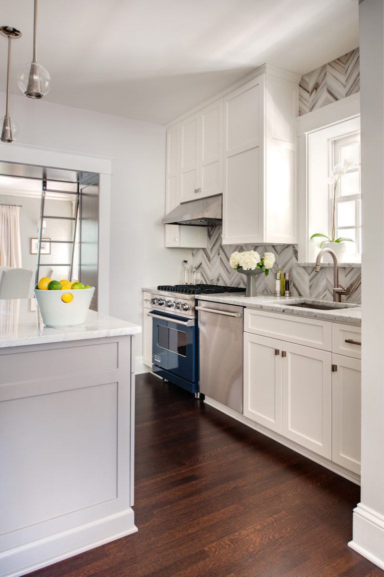
"The greatest spaces are one clean, simple idea," says Lane. "So we kept the space pretty white. But then there's a pop of blue, which is the star character, and the turquoise, a pumped up version of the blue - that's the supporting actor." Lane pulled the color scheme from the blue and turquoise Studio Bon fabrics that dress up the breakfast nook's banquette.
Elements like a herringbone backsplash, dove gray island, and marble countertops warm up the space. "With a white color scheme, you need to add texture, so it's not cold and clinical," Lane says.
Nickel pendant lights from Arteriors and knobs from Restoration Hardware add a sleek and contemporary touch. "I love beautiful hardware," says Lane. "I think of it as good jewelry. It makes such a huge difference."
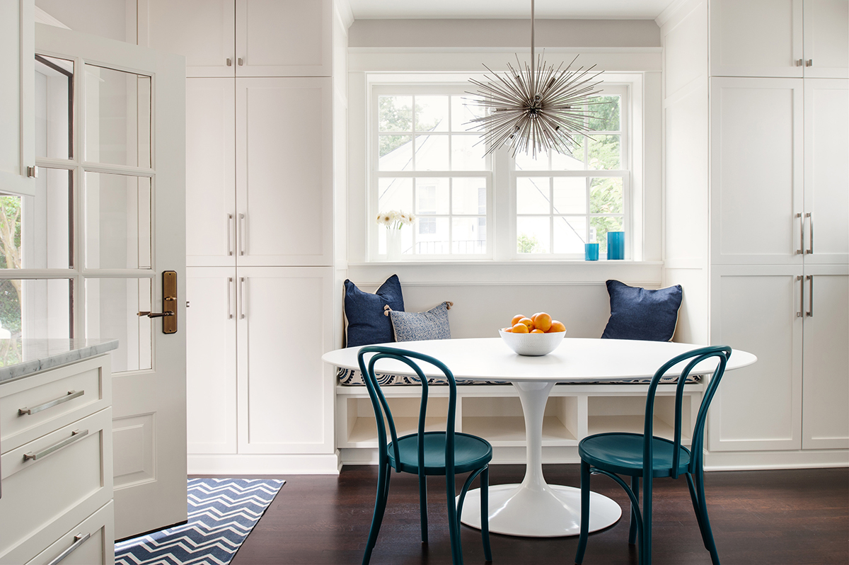
In the breakfast nook, 1920s vintage chairs are modernized with a coat of deep turquoise paint and paired with an iconic mid-century Eero Saarinen tulip table. There's additional storage under the banquette, and flanking the bench, Lane had lockers created to conceal clutter.
Kids can hang backpacks on hooks and plug devices into hidden USB ports. "It was really made to work as a mudroom that closes up," says Lane. "It's a small space, so you need to hide the clutter."
A dining room with storage to spare
In the dining room, Shaker-style millwork painted a warm dove gray maximizes storage space with high cabinetry that extends over the wide doorway. "You really have to use all your space," says Lane. "So we took advantage of the vertical space."
A library ladder gives easy access to items displayed in high places. Lane painted the wall behind the shelving a subtle blue-green. Shallow drawers are lined with felt for stowing breakables like china and crystal.
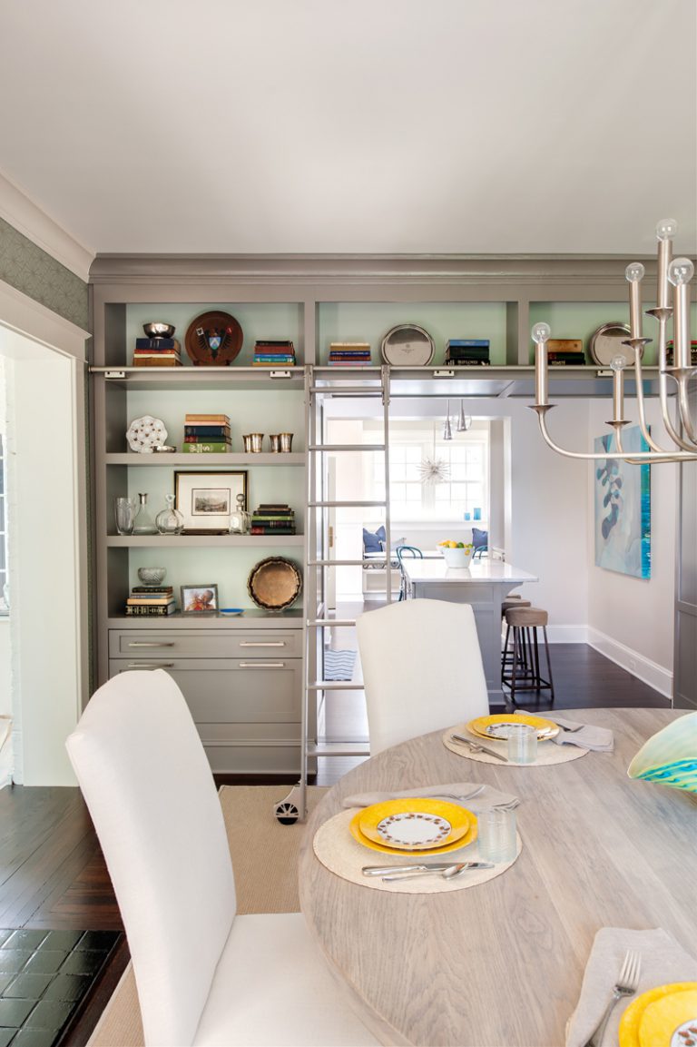
A bleached oak round table is surrounded by high-back Restoration Hardware chairs, which were placed on casters and slipcovered with a durable indoor-outdoor fabric by Perennials. A wool-sisal blend rug grounds the room, and above, a sleek chandelier from Arteriors ties the space back to the nickel hardware in the kitchen.
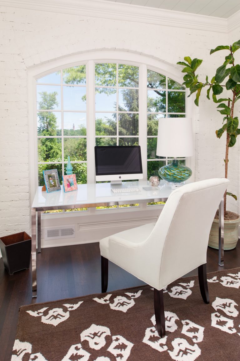
A renovation that started with the kitchen and dining area grew into Lane updating the home office as well. Originally an enclosed porch, the office had a brick floor that Lane raised to align with the rest of the home, and wooden floors now continue from the main home into the office. The window was enlarged so the homeowners can sit at their desk and enjoy views of the James River while working.
Get the look at home
Inspired by Lane’s design? Follow these tips to achieve a similar look in your own home.
- Keep it simple. "Don't try to do too many things, like too many colors, concepts, or textures," advises Lane. "Try to edit, and don’t put all your best ideas in one project."
- Make a place for everything, and put everything in its place. "I always think of that phrase when I think about the kitchen," says Lane. "You have to think about what’s going in each cabinet, and where each appliance goes." Tuck trash and recycling under the counter, and add a built-in paper towel holder to keep clutter at bay. It creates a stress-free, easy-to-clean environment.
- Think vertically. "Take advantage of the vertical space above doorways when you have a tight, small space," says Lane. A built-in library ladder or free-standing ladder makes a decorative statement, while also giving you easy access to your out-of-reach goods.
Photos by Ansel Olson
Related: