Colorado design firm Rowland + Broughton embraced original architectural elements and added new contemporary finishes to update a beautiful three-story dwelling in Aspen.
Located at the base of Red Mountain, the picturesque property consists of four parcels - two developed and two undeveloped. On an 8-acre parcels stands an 8,000-square-foot mountain home built in 1968 by Aspen's first female architect, Ellie Brickham, and originally owned by Stein Eriksen, who helped form Aspen and its ski culture.
Rowland + Broughton updated the large mountain home to improve its functionality, and also renovated its neighboring barn structure, which sits on a 3.4-acre parcel and is connected to the main house by a subterranean tunnel. "It's a place to read, think, and entertain," says Rowland + Broughton senior project manager Sara Upton of the backyard retreat.
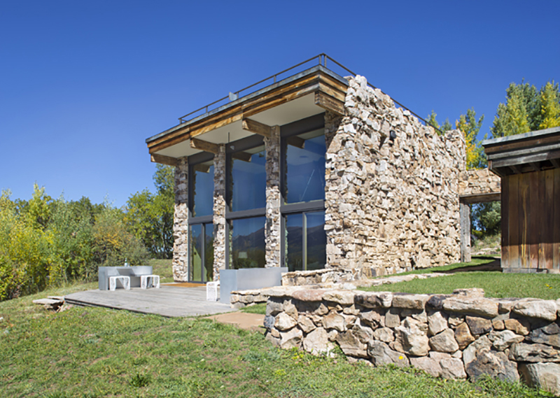
The barn studio, as the owners refer to the structure, was built in 1988; according to a building permit application, the barn itself probably dates to the early 1970s. The design firm didn't do much to the stone exterior and interior of the studio, other than a little cosmetic maintenance.

"We left the original stone walls on the inside. We worked with them and tried to enhance them with lighting," says Upton. "We embraced a lot of aspects that were already there."
Inside, the design firm added new finishes and architectural accents, while keeping some of the existing interior elements to pay homage to the structure's history. "It was important to meld the old and new within the space," says Upton.
Updates that delight
The three-story, 3,197-square-foot studio includes an original 1970s green roof, along with a cozy kitchen, small bathroom, loft, and two-story library.
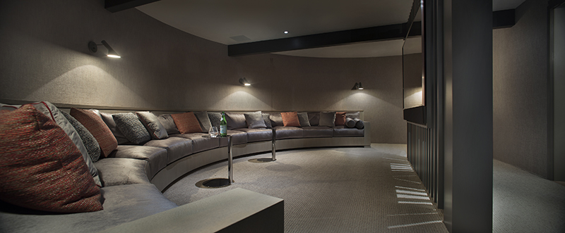
The downstairs originally housed a workout space, a reading room, and a wet bar. Rowland + Broughton transformed the workout area into a media room, where the family now gathers to watch movies and sports together.
The main floor includes the entry, living room, kitchen, and a sprawling deck with breathtaking views of the rugged Elk Mountains.
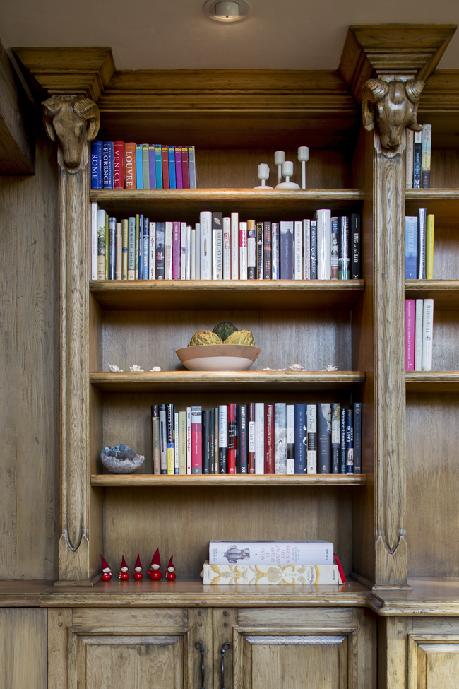
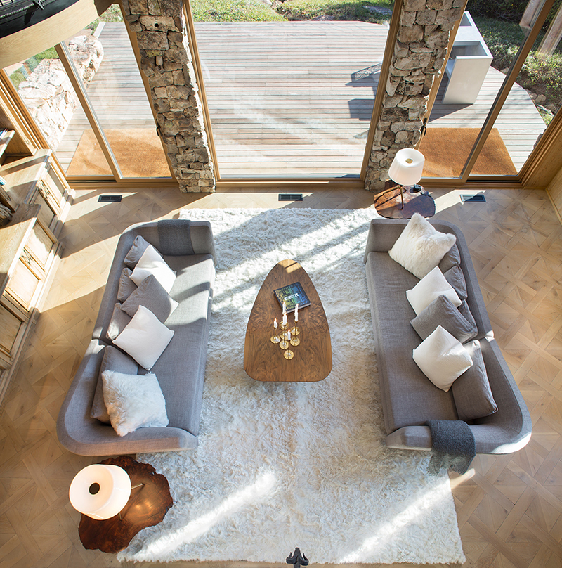
In the living area, Rowland + Broughton extended the millwork so it would complement the existing bookshelves.
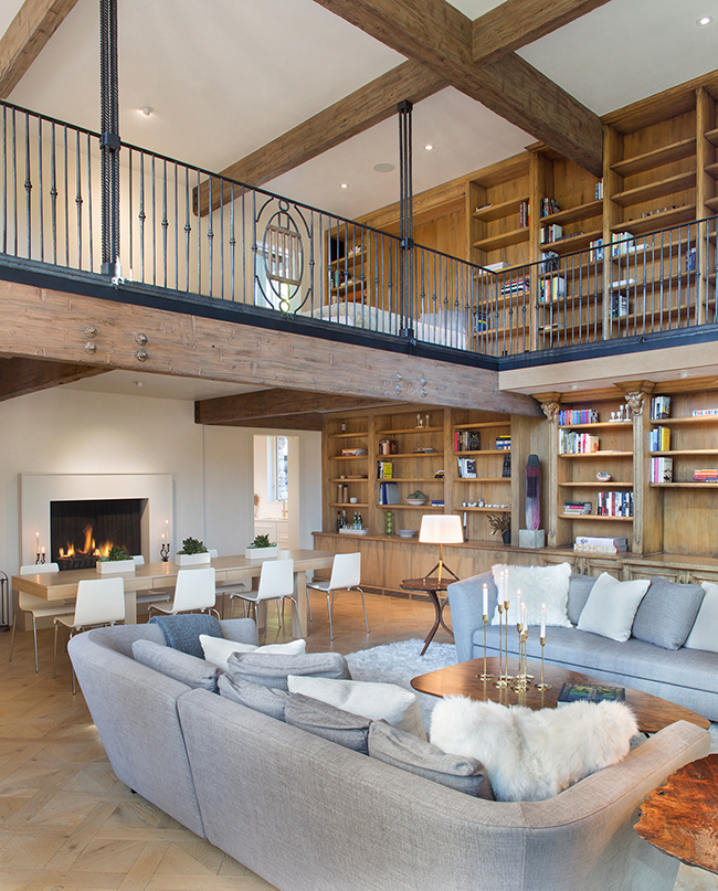
"There were some pretty elaborate millwork pieces in the main two-story-high space, which featured fun carved animal heads from the former owners," says Upton. "We wanted to keep some of that delight and work with it. Embracing that was important."
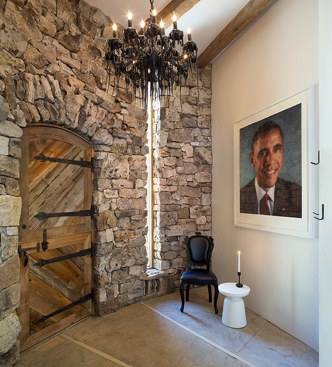
Originally, the entry had heavy stone walls, so the design firm added plaster to lighten and brighten the space. They also added a lock to the original wooden Dutch door.
Rowland + Broughton updated the fireplace facade as well. While keeping the original firebox, moss rock was replaced with plaster, and a detailed metal surround was painted a crisp white, giving the room a more contemporary and clean look.
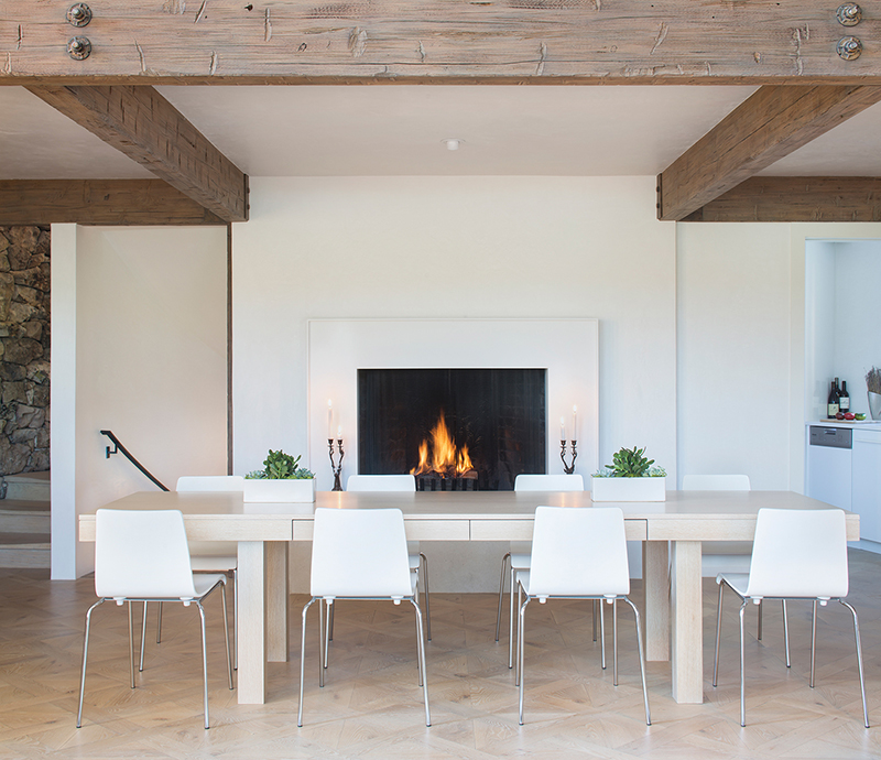
The original wood beams were cleaned up and refinished so they didn't look as rustic. "We wanted the beams to play a role, but not be an attention-getter," says Upton.
Bright spots
The kitchen and bathroom needed to be brought up to date as well. In the cozy kitchen, an 18-inch dishwasher, small cooktop, and refrigerator were added.
In the bathroom, carpet was replaced with wood flooring, and the walls were covered with 2-inch glass tiles. Using an all-white color scheme makes the small bathroom appear larger and brighter.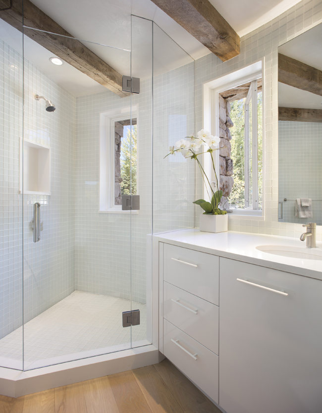
"We wanted to keep everything really light and white upstairs, then use more black for the subterranean space," says Upton of the design concept. "When you descend, it's all about dark and cool."
The owners, who have impeccable taste, furnished the barn studio with an array of unique pieces. "Our clients have a high appreciation for design," says Upton. "They were influenced by European culture and designs. They love Italian furniture, clean lines, and beautiful things that delight. They have very interesting pieces."
Get the look at home
- Strip out dated materials. Replace old-fashioned flooring, tile, and doors with architectural materials that are fresh and timeless.
- Add solar shades. Installing solar shades cuts down on glare and allows you to appreciate views. "We did that for the two-story glass wall," says Upton, who also replaced the expansive windows. "The sun just blasts in there. The shades make the home more energy-efficient."
- Beef up your storage. "Adding shelves is always a great way to improve the storage space within a home," says Upton. "It's a combination of adding drawers that can hide utilitarian things away, and open shelving as a place to show off pieces."
See more home design inspiration on Zillow Digs.
Photos by Brent Moss Photography.
Related: