Living in the past is almost never a good thing. For the owners of a historic craftsman bungalow in Seattle, WA, their home’s small segmented rooms, typical of the last century, were crying out for a more modern and open floor plan.
"Now some 100 years later, when we get a hold of these houses, they don’t mesh with the way we live today," says Kim Clements, owner and creative director of JAS Design Build. "What we want is more space and relationship to our family. Those patterns of living are different now, and have to do with more modern use of space. And, we want openness."
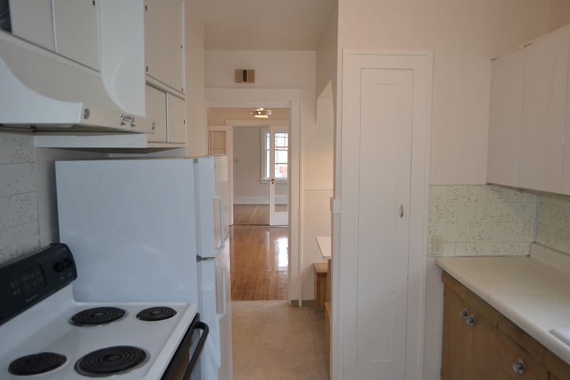
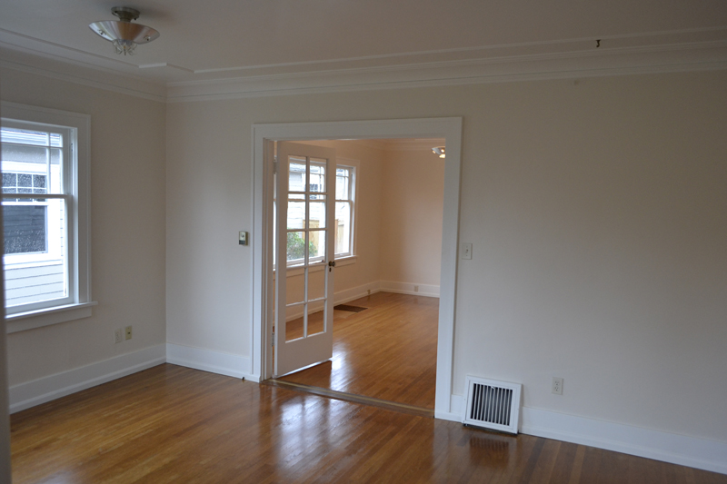
With that in mind, the cozy bungalow from the early 1900s was opened up, creating more unified and flowing spaces from room to room.
First, a facelift
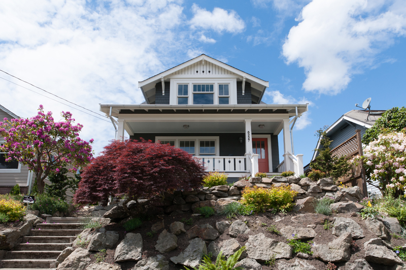
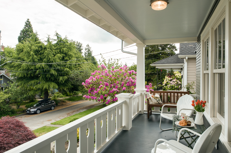
At the front of the bungalow, a gabled entryway was removed to make way for a large covered porch that echoes the front porches of the neighboring homes that line the street.
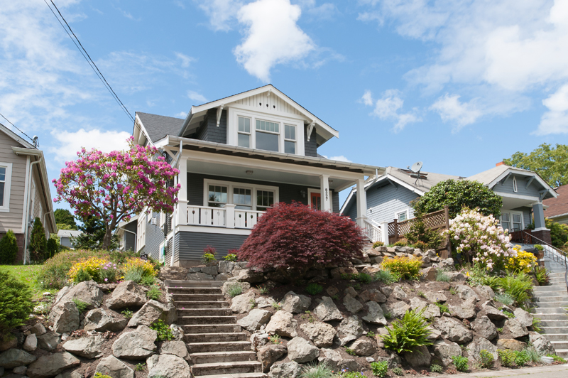
These modest yet charming bungalows from the early 1900s weren't built by architects, Clements says; homeowners purchased the house plans themselves and then customized the homes to their personal tastes.
The bungalows were constructed by craftsman, not general contractors, so these houses are "craftsman" bungalows in the sense that they are describing the skill of the person who built them, not the style of the house.
Goodbye, walls
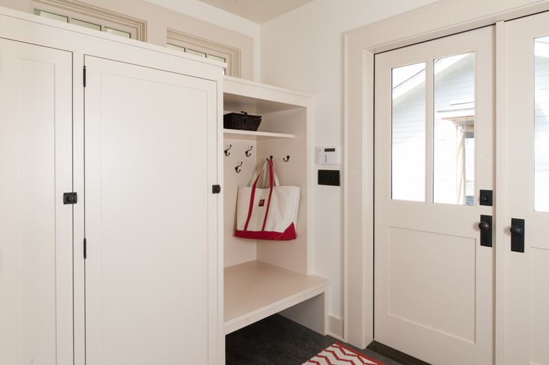
At the home’s entry, the foyer was opened up, allowing it to flow into the neighboring living room. A bench with storage drawers and wall hooks provides plenty of space for guests to place bags and hang coats. Wainscoting, built-ins, and decorative stair railing add authentic character, paying homage to the bungalow's heyday.
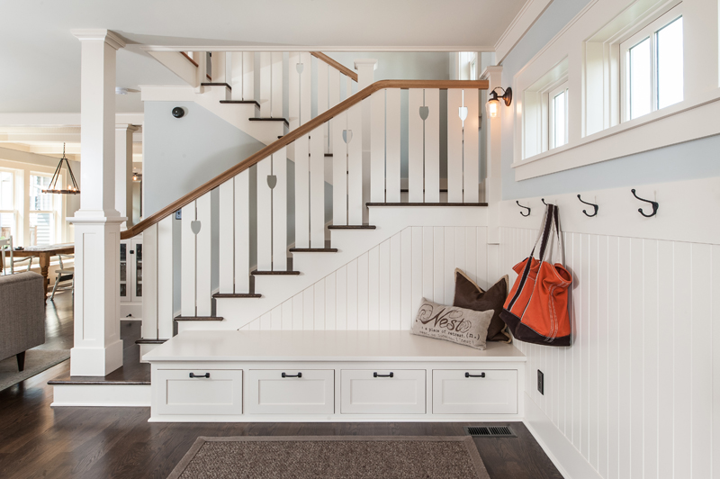
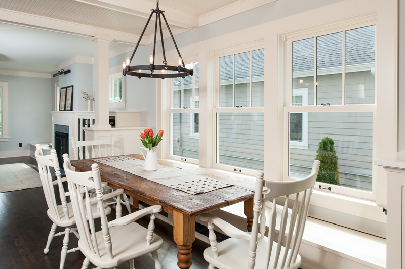
When taking down walls and blending the living room, dining room, and kitchen into a flowing space, Clements wanted to ensure the separate spaces didn't lose their "room-ness." Therefore, built-ins topped with columns were constructed between the spaces to create boundaries without closing off each room.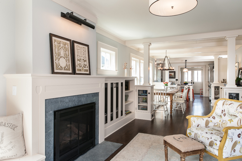
"There is still enough definition that you can call it a living room, dining room and kitchen," says Clements, "yet they aren't completely separate. Creating openness while not losing the quality of the heritage of old houses is really what we have worked to accomplish."
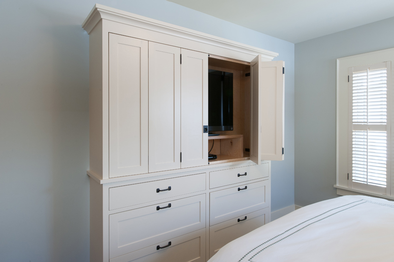
The built-ins are a nod to the bungalow's period, and also provide thoughtful storage for the narrow home. Custom cabinetry was incorporated in the family room to tuck away the homeowners' flat-screen television.
A working kitchen
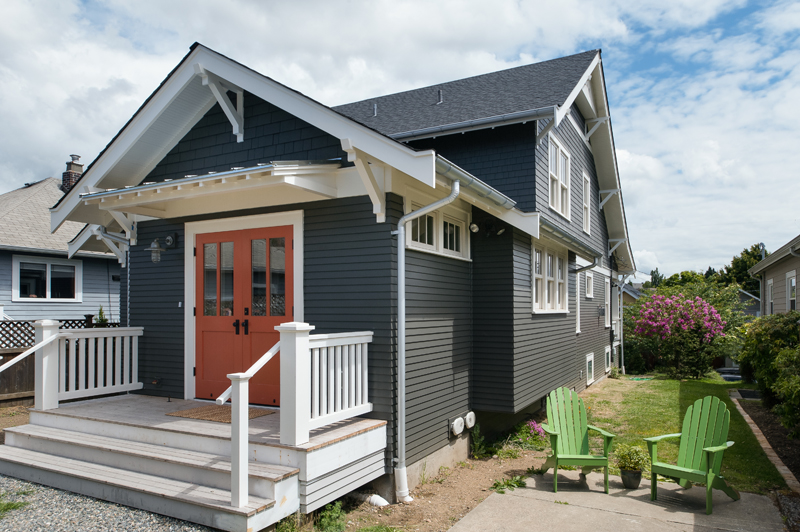
The kitchen was enlarged by 30 feet merely by adding a cantilevered bump out into the side yard, making room for a double galley with an oversized island. The bump out, which is the depth of a counter, is now lined with a row of windows, and houses a farm sink and plenty of storage underneath. "That 30 square feet changes the entire game," says Clements. "It was a sneaky trick to make a little more space without going whole hog."
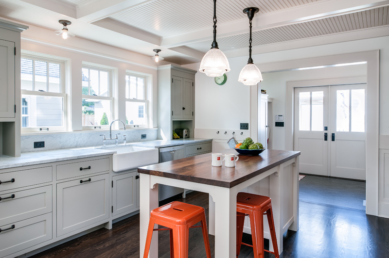
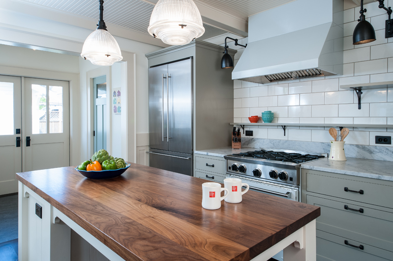
"Simplify and consolidate" was Clements' guiding philosophy when planning out the kitchen layout, since she was working with a narrow space. Clements eschewed unnecessary items like an island sink, double ovens, and a built-in microwave, instead opting for more counter space and cabinet storage. "It's a working kitchen, and it's old-fashioned in a away, but it's completely modern in its sensibilities."
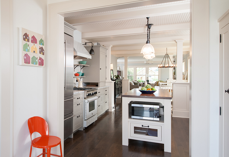
Past the kitchen, a contemporary mudroom boasts an oversized cupboard for food storage and cleaning supplies. "I think people need to think about how much they actually need within arms reach, and how many things don’t need to be there," she says of the kitchen and mudroom layout. "You don’t need all of your dry goods in the kitchen. Then you have more room for windows without upper cabinets covering the walls."
Take the full home tour:
Get the look at home
- Evaluate what you keep in your kitchen. "Really assess what you have, what you use, and and how often you use it," says Clements. She advises keeping the items that you use daily within reach, and storing items you use a few times a year out of sight in the basement.
- Get rid of your upper cabinets. Unscrewing your upper cabinets and removing them from the walls, reduces visual clutter in the kitchen. "If you can reduce the number of upper cabinets you have, your kitchen feels roomier and better," says Clements. If you’re a renter, she suggests removing cabinet doors to open up a small kitchen. Store them somewhere out of the way, and then when you move out you can easily screw them back on.
- Artfully arrange your objects. Without cabinets concealing your items, arranging your dishes and kitchenware artfully has a big impact. "It makes it feel more familiar and comfortable and pretty," says Clements, "and that can change the feeling of a space dramatically."
Photos by Jesse Young.
Related: