It's never easy to restore an old home, but redesigning a home built in the 1980s - an era not particularly loved for its style - requires imagination.
Debbie Cederlind and Lora Lindberg, Seattle house-flipping pros and owners of Urban Squirrel, recently tackled a Bothell, WA home built in 1989 that didn't have much going for it on the style front.
"With 1980s houses, it's a challenge to put character back in,” says Cederlind. “We started with no character, but it felt good at the end. We made it stand out and gave it some specialness that wasn't there."
The traditional-style home had already been renovated before Cederlind and Lindberg got their hands on it, but the work was less than desirable.
"There were some hideous paint colors on the wall,” Lindberg recalls. “You could see they were trying to inject character with super bright yellows and reds. And there was a bathroom with no windows. It was livable, but pretty ugly inside."
Let it breathe
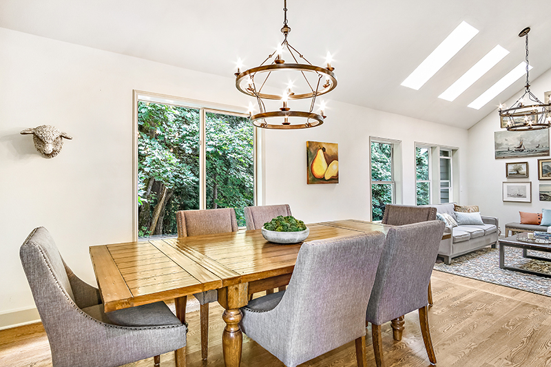
When Cederlind and Lindberg first walked into the home, their main objective was to let some much-needed light inside.
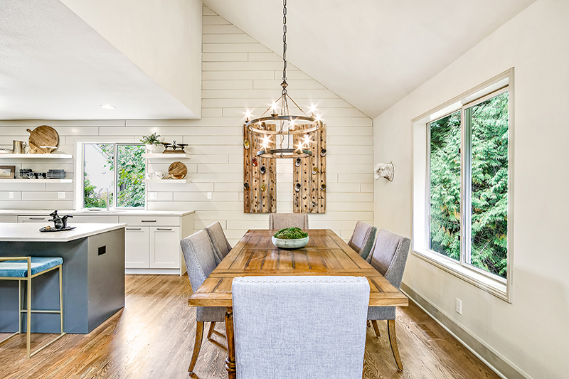
They removed a wall between the kitchen and dining room and opened up the stairwell leading down to the basement. The stairwell was long and completely closed up with a door at the top, so the designers decided to open both sides of the wall.
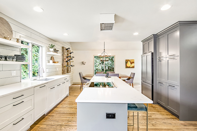
"We let it breathe a little bit," Lindberg says.
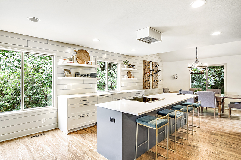
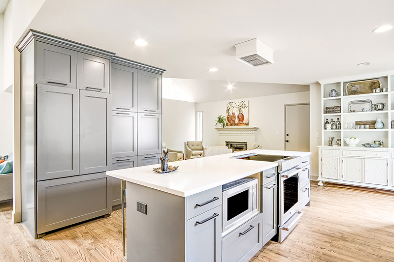
The kitchen was reimagined - taken from dark and unremarkable to sleek, light and modern, featuring a charcoal-colored island, white open shelving and a shiplap treatment. The designers also covered the appliances with paneling to make them less obvious.
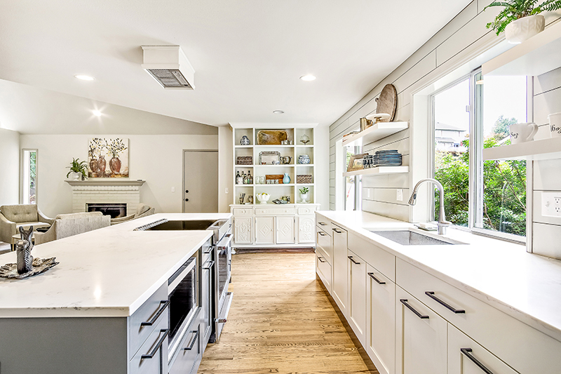
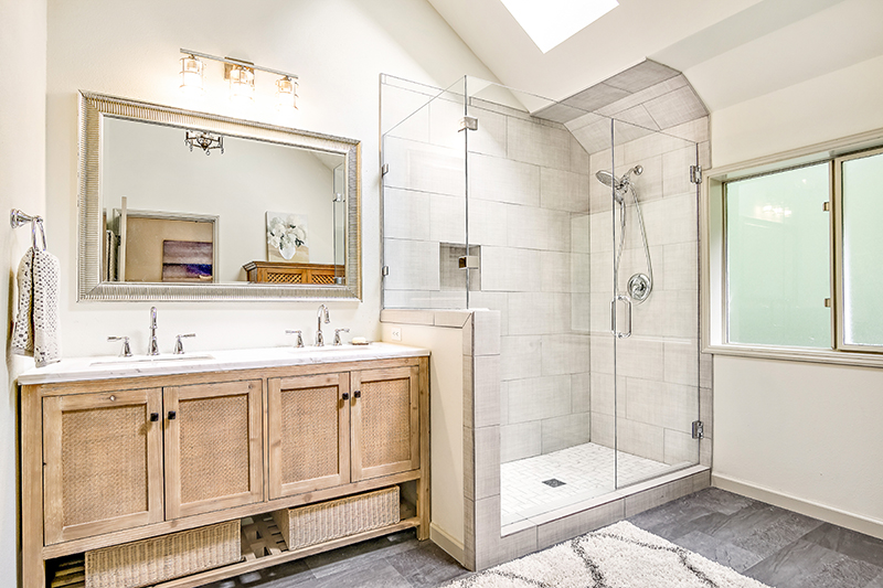
In addition to revamping the kitchen and the main bathroom, which was lightened with a rectangular exterior window and some large-piece tile work in the shower, the designers also altered the awkward layout upstairs.
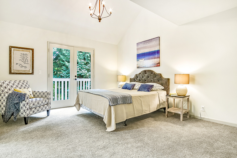
They decided to close off an outdated half wall that overlooked the living space and front entryway, then create a bedroom to replace the lofted office that previously existed there.
Inject character
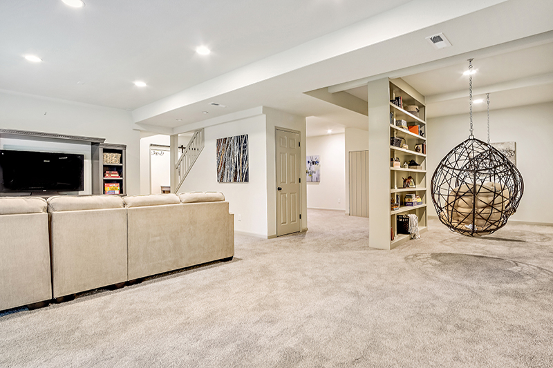
The bulk of the work and style added to the home was in the basement. "The space was super creepy and weird and didn't flow well," Lindberg says.
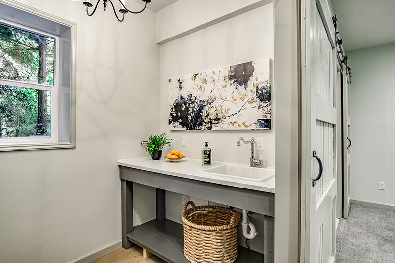
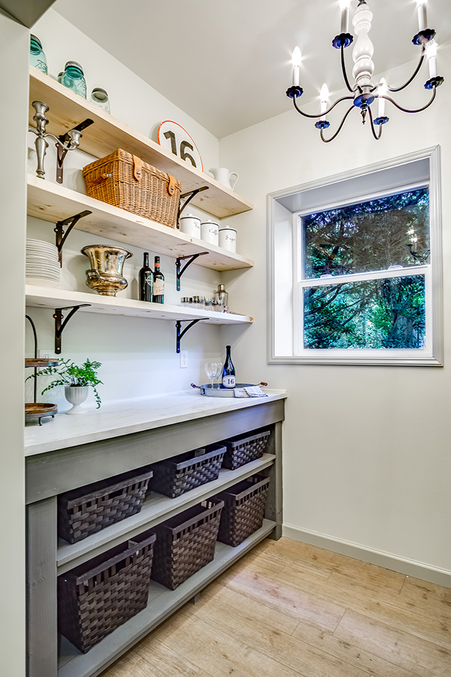
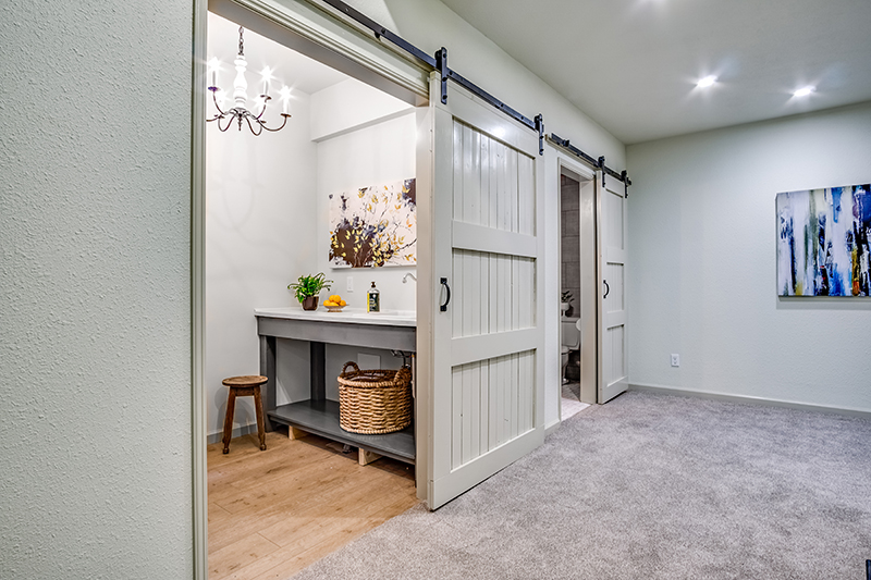
Out of this blank, dark and uninviting slate, the designers created two bedrooms, a library, a kitchenette and an additional bathroom. The kitchenette and bathroom feature sliding barn doors, which open up to the large living space downstairs.
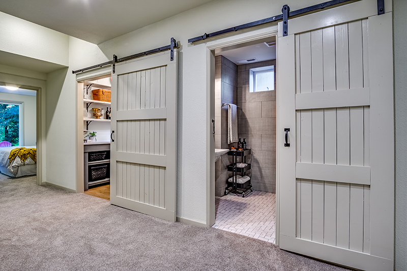
The kitchenette is every bit as stylish as the full kitchen, featuring open shelving, charcoal-colored open cabinets and stone counters.
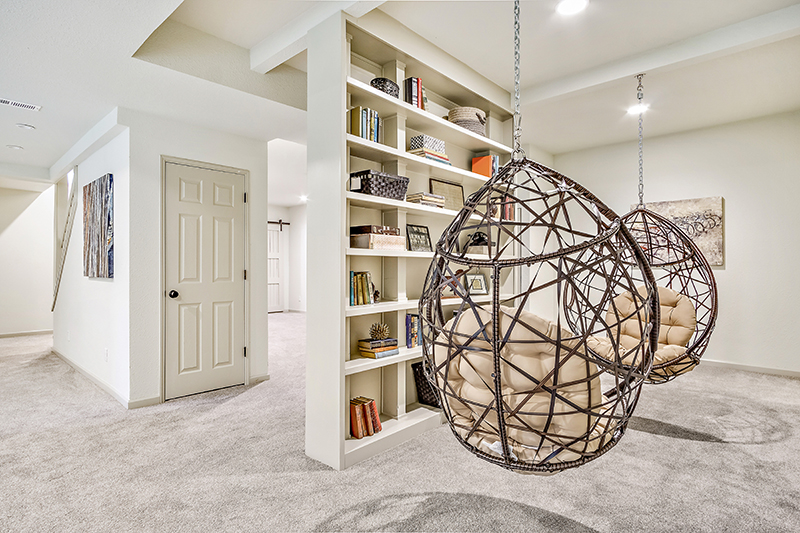
The biggest quandary the designers faced in the basement was deciding what to do with the three posts in the middle of the room. After much deliberation, they turned the posts into a built-in library, adorning it with vintage-style hanging chairs on each side suspended from beams.
"We went around and around, and that was the trickiest thing to figure out,” Cederlind says. “But if you’re a family with kids, you want the whole basement to be a big playground.”
Get the look at home
- Make your kitchen flow. "Now that we're doing these open kitchens, people don't want their kitchen to look like a kitchen. They want it to flow," Cederlind says. Add artwork, pottery and other accessories to make the room feel less like a kitchen and more like the rest of your home.
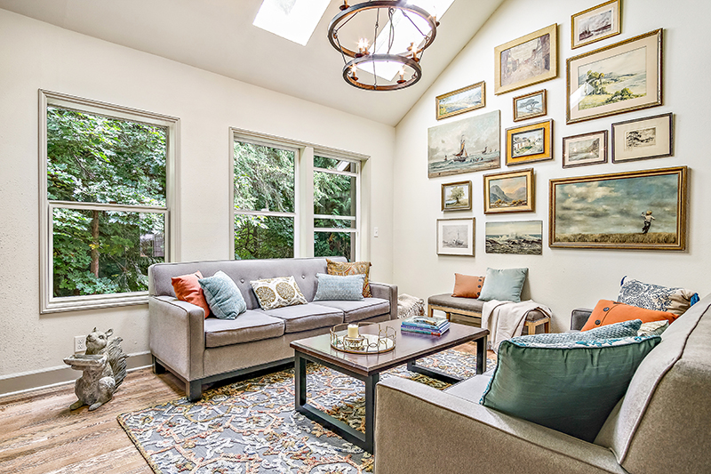
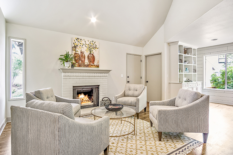
- Consider conversation. "We think a lot about our seating arrangements. We think about conversation and not about TV placement," Lindberg says. Face couches and chairs toward each other - not the TV - to create a cozy space for chatting with friends and loved ones.
- Incorporate contrast. "You need the balance of dark and bright," Cederlind says. If you have dark hardwood floors, don't feel like you have to match your cabinetry. Creating contrast will prevent your home from looking too dark or dated.
Take the full home tour:






Related: