Bigger isn't always better. In the case of this West Seattle remodel, the owners were set against a large, looming addition that they feared would overwhelm surrounding homes. They turned to Seattle design firm Board & Vellum, where they found the solution to their need for extra space.
In a surprisingly compact 740 square feet, their new addition incorporates space-saving techniques and unique design elements without overshadowing the neighbors.
The existing single-story home featured a finished basement, a small living room, two small bedrooms on the main level, an awkward entry, and few distinguishing features. "It just didn't live large enough," says Jeff Pelletier, principal at Board & Vellum. "There was no real breathing room at all."
Understandably, the owners wanted more space, but they weren't interested in sacrificing curb appeal to get it. Pelletier, who says he loves optimizing small spaces, was the perfect architect to take on the challenge.
A second story made the most sense to get the square footage the family needed, and Pelletier used a combination of bold structural choices and whimsical details to achieve the goal.
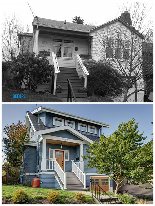
Moving up
A second-story addition naturally requires a new stairway to reach it. The typical approach of stacking the new staircase atop the basement set of stairs initially made a lot of sense, Pelletier says, but it "created a challenging second floor that didn't really work."
Instead, Pelletier and his team turned a former front bedroom into an entry hall, and placed the new stairway just inside the front door. Then, they added a large archway and glass cabinets between the entry hall and the adjoining living room.
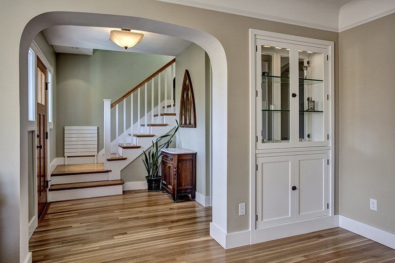
A generous pass-through helps the room spill out into an adjoining space without adding any square footage, while double-sided glass cabinets increase the visual size of the room and help it feel larger. "It's a great trick for small spaces, where you need storage and a more open feel," Pelletier says.
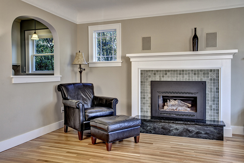
Another of the home's space-optimizing design elements is a 3-foot overhang of the second story at the rear of the house. Placing the bulk at the back of the house easily hides the added space, and also creates a welcome cover over the back deck and grill.
It's the little things
While the bulk of the family's new space came with the construction of the second story, a number of smaller design elements helped the family further realize their addition's potential.
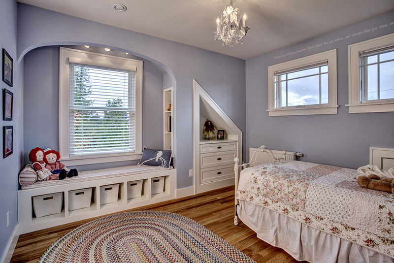
The two kids' rooms in the new upstairs space offered the most potential for creative design. "The rooms didn't have to be big, but they had to be interesting," says Pelletier.
In the daughter's room, he created a reading nook in a window seat, with built-in bookshelves and storage underneath. In the boy's room, he opened up the attic to create a loft accessed by a wall-mounted ladder, and closet doors slide side to side instead of swinging open into the room.
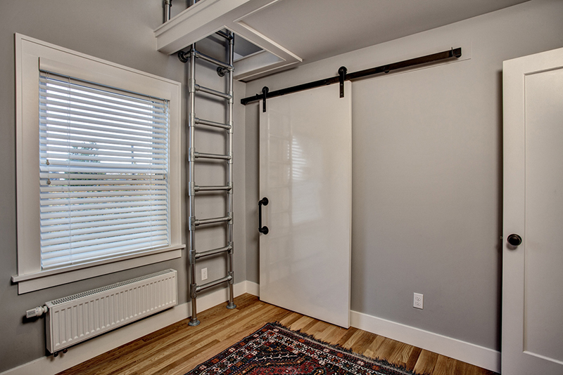
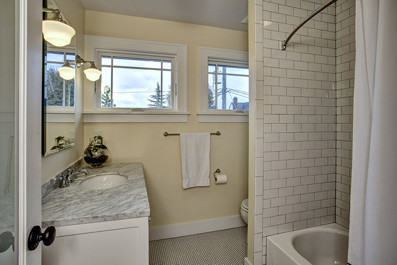
Instead of adding doors to upstairs linen closets, Pelletier designed a series of drawers so the closet looks like a built-in cabinet. And in the kids' bathroom, Pelletier held out for a bathtub that was just slightly smaller than a conventional tub (4 1/2 feet long versus 5 feet long) but fit just right in the available space.
"That extra 6 inches made all the difference," says Pelletier. "Sometimes you have to look for solutions that are a little more custom but allow the home to feel larger."
Make the most of your remodel
Sometimes small design changes are all it takes to let a small home breathe. Pelletier offers a few tips to homeowners looking to add space to their existing homes.
- Turn an attic into loft space. Removing a ceiling to open up an attic can make small bedrooms feel larger. It also allows for the option of a sleeping loft - something kids especially love.
- Maximize space with built-ins. Adding built-in nooks - such as the glass cabinet in the entryway of this West Seattle home - offers space to store linens and collectibles, while also creating a sight line between two rooms.
- Blend two small rooms. Adding French doors between a small office and a small living area gives homeowners the option of combining the two. Swing the doors open to create a combined space, and close the doors when there's work to be done.
- Consider a finished basement. Remodeling an unfinished basement is a sure way to gain more space, and it's usually less expensive than adding on vertically.
See more home design inspiration on Zillow Digs.
Photos by John G. Wilbanks Photography
Related: