For HGTV's hit television show "House Hunters," California designer Caitlin Murray of Black Lacquer Design was tapped to renovate the dated kitchen in a quaint 1940s bungalow, located in the Los Angeles valley.
Last renovated in the '80s, the drab kitchen featured yellow walls, faux-wood laminate flooring, and oak cabinetry. The space was also closed off from the neighboring dining room, making entertaining and traffic flow cumbersome.
Murray removed the wall separating the dining room and kitchen, creating an open, flowing space with a peninsula of cabinetry now acting as a barrier between the two spaces.
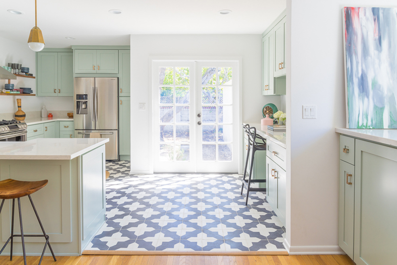
Previously, a washer and dryer were tucked in the kitchen near the back door. Murray removed the laundry appliances and installed French doors, adding more functionality to the kitchen.
"The French doors added a ton of natural light, too," she says. Next to the French doors, a wall of cabinetry was removed to accommodate a new workstation.
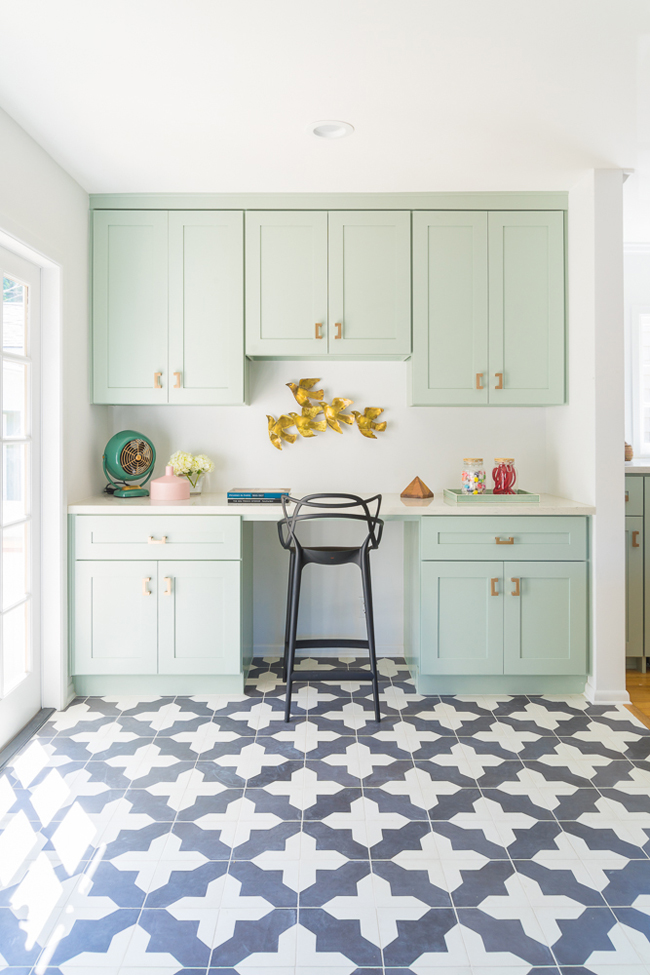
The homeowner wanted a light and fresh kitchen that embraced a soothing color scheme of greens and blues. "She mentioned loving pattern and wallpaper," says Murray. "Wallpaper was a little too much for the kitchen, though."
So, rather than applying pattern to the walls, Murray finished the floor in a graphic black-and-white cement tile by Granada - a nod to the home’s original Spanish-style architecture.
Streamlined Shaker-style cabinets were painted in the subtle Benjamin Moore shade Gray Wisp so they wouldn't compete with the bold flooring. And with a satin finish, the cabinets take on a slight sheen.
"It's almost like a desaturated light mint color," says Murray of the unique shade. "We needed color on the cabinets, and I didn't want it to be too bold, because it needs to work with the other design elements, like the flooring."
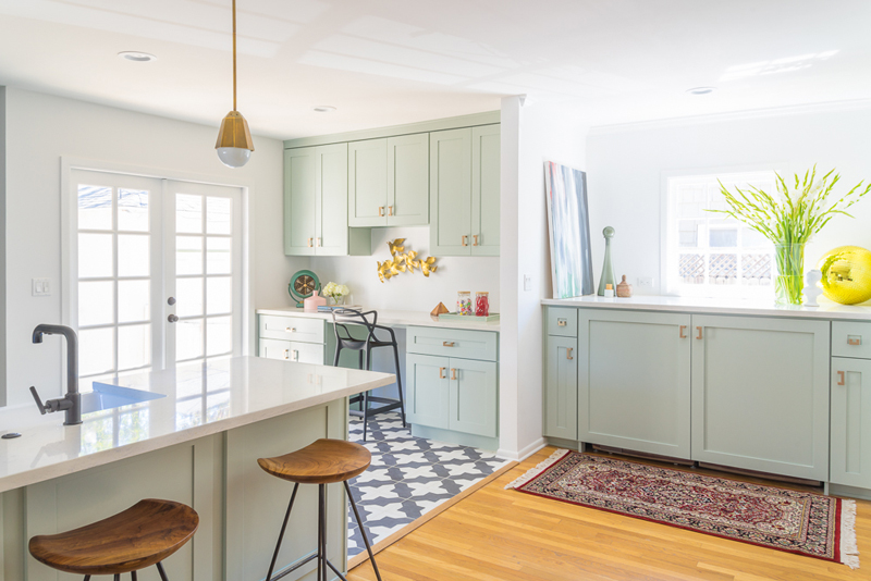
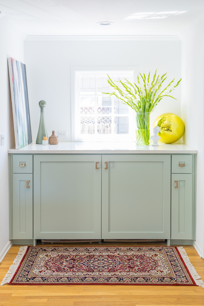
The countertops are made of cost-friendly composite, a material created to look like luxe Carrara marble. To accessorize, Murray added champagne-bronze hardware to the cabinetry and drawers, which also ties into the bronze pendant lights from Arteriors.
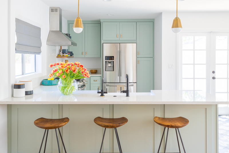
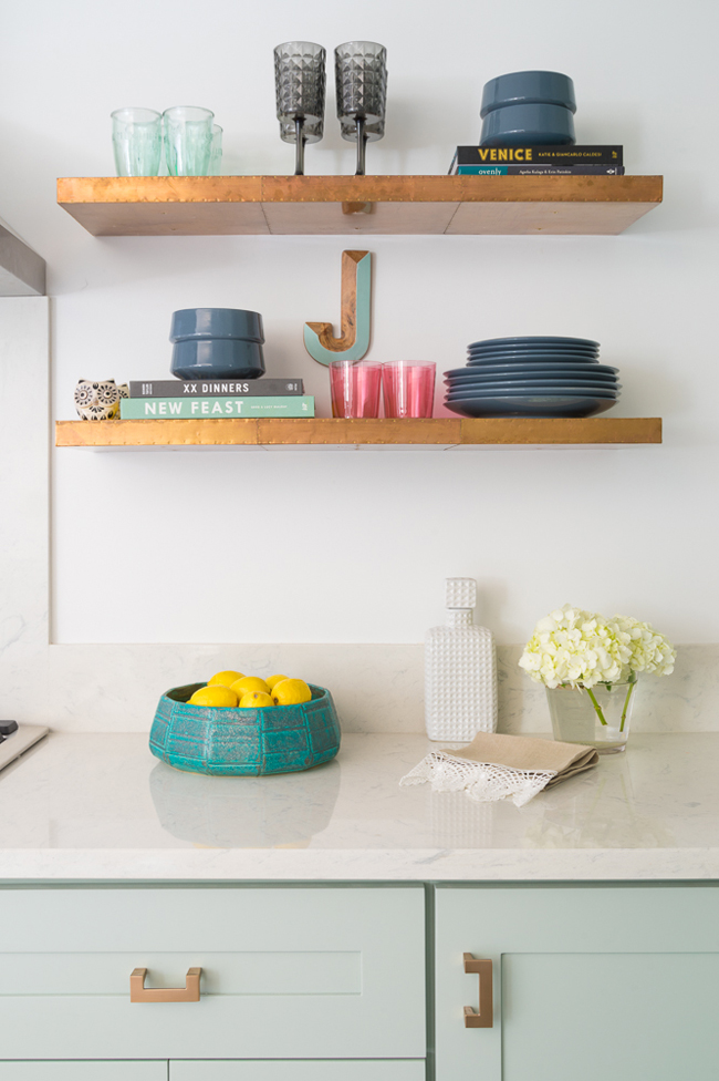
Wood elements, like floating shelves and stools from Anthropologie, warm up the cool white-and-green space. And the open shelving, used in lieu of cabinetry in some instances, brightens the space.
Get the look at home
- Think outside the box with paint color. "A subtle spin on a neutral can make a big difference," says Murray. For instance, with this project, she painted the kitchen cabinets a light green with hints of gray. "You don’t have to go dramatic if you’re painting your cabinets. Just do some something subtle, and it will make a big difference."
- Be mindful of hardware. Switching cabinet knobs and drawer pulls is a small change that makes a big difference. But pay attention to the existing hardware’s measurements so you don't have to drill new holes for the new hardware.
- Add decorative elements. "How you decorate your kitchen can make all the difference," says Murray. "Keep a mix of decorative and functional items on your countertops. And anything you don’t want to see every day - put it away."
Photos by Eron Rauch.
Related: