Designer Deidre Oliver, with Niwot, CO firm Oliver Designs, transformed her neighbor's '90s master bath into a contemporary spa sanctuary with high-end plumbing and beautiful finishes.
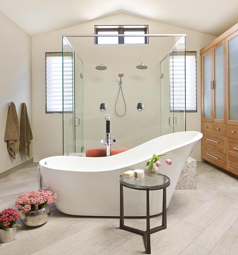
Oliver reconfigured the 432-square-foot bathroom’s layout to better utilize the center of the room, which had been empty, wasted space. The original layout consisted of an L-shaped vanity, above-mirror Hollywood lights, and quartz countertops.
Along with a contemporary freestanding soaking tub by Barclay, a beautifully designed double shower (with two entrances and a granite bench) was installed in the center of the space. "They wanted a big walk-in shower," says Oliver.

Walls were painted in a light gray, and the floor trim a darker gray for contrast. "Gray walls with darker gray on the trim provide a beautiful visual contrast," Oliver explains.
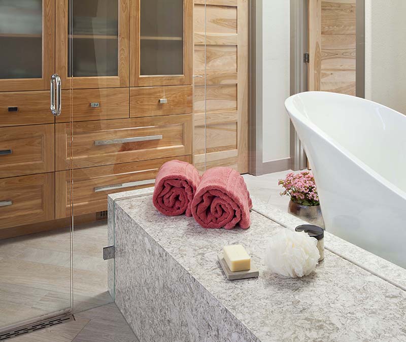
Structurally, another window was added to bring in more light, and heated ceramic tiles reminiscent of wood were installed throughout (even in the shower) to keep the bathroom warm and cozy while bathing on cold Colorado days. The shower wall was covered in large-format tiles to give it a clean and seamless look.
"The bathroom would've felt cold with all the tile and glass, so we contrasted with warm wood elements for balance," says Oliver. "The wood provides a perfect organic counterpoint to the crisp lines of the walls and countertops."
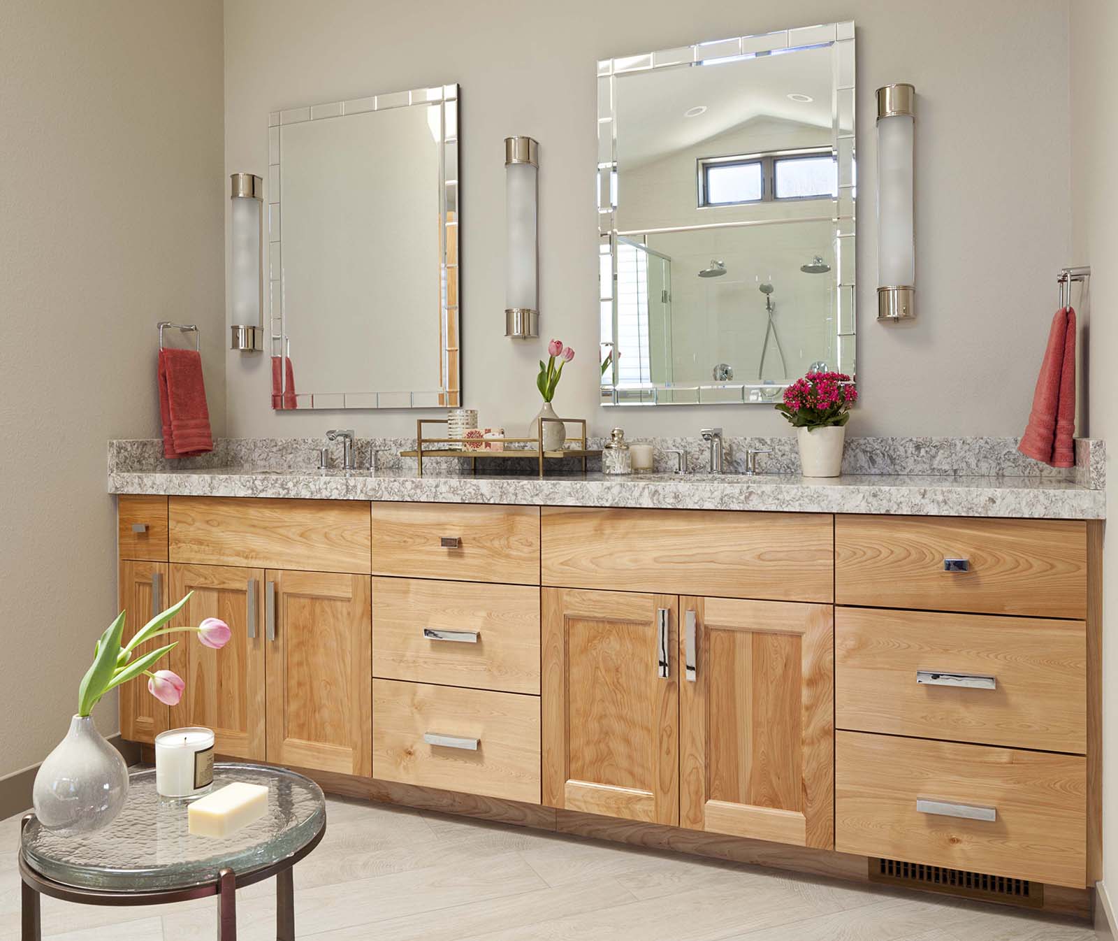
A new wood door with frosted glass gives bathers privacy, while also welcoming in natural light, and red oak cabinets were installed for the vanity, creating a "linen closet" for towels and toiletries.
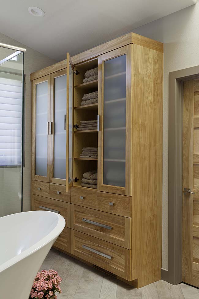
Polished nickel Atlas Homewares pulls complement the Cifial faucets used for the sinks, bathtub, and shower head.
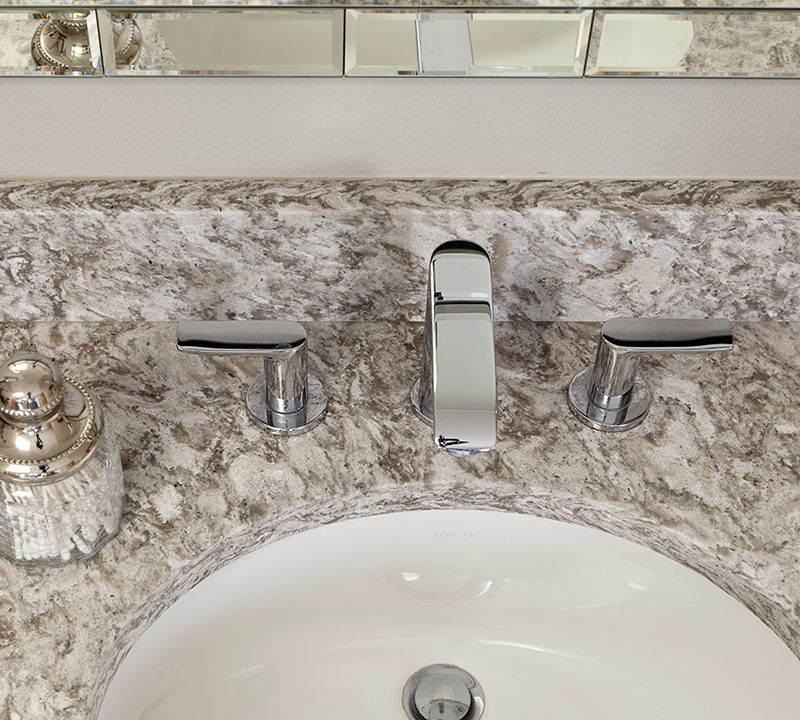
Decorative mirrors add a hint of glamour to the vanity, while sconces from Visual Comfort are hung at face height for optimal lighting when beautifying in front of the mirror.
Get the look at home
-
- Layer your lighting. "You can’t rely on a single light source in a room," says Oliver. "Sometimes you need ambient light, and other times you need task lighting to see your face. Dimmers are good for achieving all-around light, too."
- Choose large-format wall tiles. "These allow for fewer grout lines and give the shower a cleaner, more updated look," says Oliver. "And they’re much easier to clean."
- Paint old oak trim. "This can really elevate and freshen up a space," says Oliver. "White is a go-to choice for people, but if you’re a bit daring, consider painting trim a much darker color than the wall color."
- Balance hard and soft materials. "Anytime you can contrast hard elements - like stone, tile, countertops, and ceramic - with some wood elements, you provide a beautiful counterpoint to something that’s crisp and cool," says Oliver. "The wood really warms up the space and makes it feel more inviting.
See more home design inspiration on Zillow Digs.
Photography by S. Brenner.
Related: