When Portland interior designer Jessica Helgerson faced the daunting task of renovating a mid-century treasure, her first question was: "What would Saul do?"
The residence in question, the Feldman House, was designed by local architect Saul Zaik in 1956. The wood-clad home, which features a sensationally low-slung gable roof and floor-to-ceiling glass walls, was suffering from a bit of an identity crisis: The kitchen with cheap white laminate cabinets had been raised so it was not level with the adjacent floors, and the ceilings in the bathroom were taller than in the master bedroom.
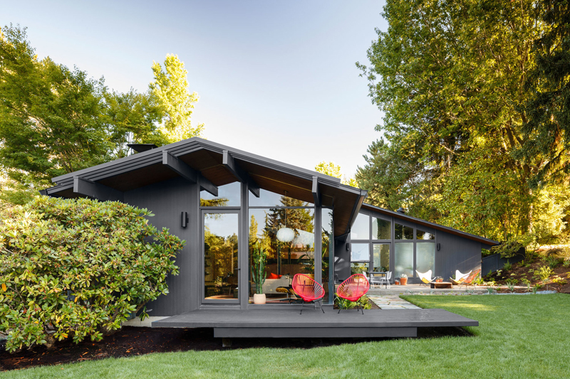
And that was just the beginning. "There was a real disconnect between the front and the back of the house," Helgerson recalls. "The living room was lovely and relatively unchanged, but the back of the house got progressively funkier."
The interior floor plan, which had been altered over the years by a series of misguided remodels, lacked cohesion and seemed to detract from Zaik's original vision - an experimental but harmonious marriage of indoor and outdoor spaces.
Helgerson made it her mission to be authentic to that vision, "to use materials that felt of the area" and make it feel as if the home had not been remodeled. "We weren't slavishly recreating the past," she says, "but we really were trying to think about the vintage of the house, and the goal of the house, and to be respectful of that when we were designing."
A significantly different plan
Presented with three design plans, the young family who had purchased the home decided to go with "the most significantly different plan, which was the one we were advocating for," Helgerson recalls.
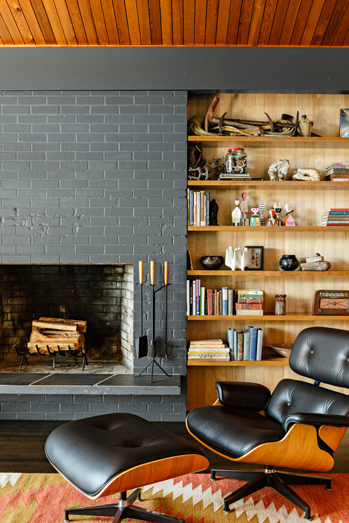
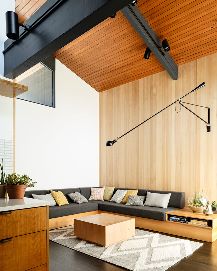
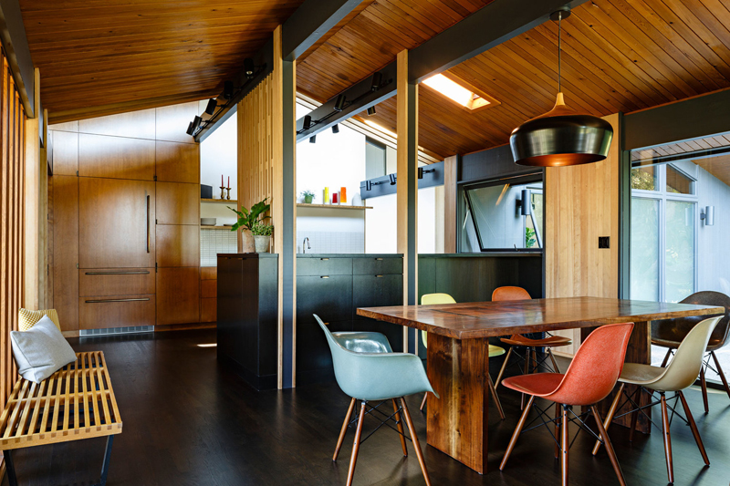
That meant replacing the wooden shelves that had been removed from the living room wall, adding new windows, and overhauling the kitchen with new birch cabinetry and a custom screen that mimicked the original front door.
A mud room, which solved the problem of a front door and garage door that met in the same spot, was later added, along with a carport entry.
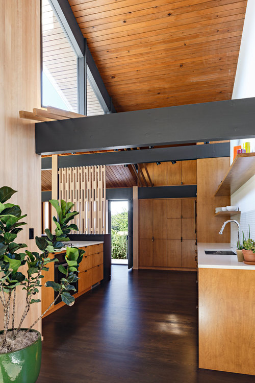
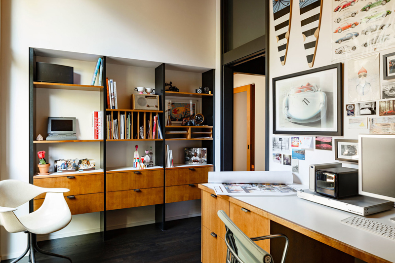
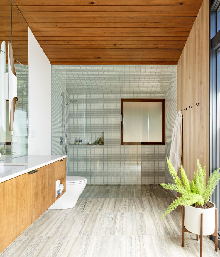
As the family oversaw the progress, Helgerson studied up on the little details that characterized Zaik's work - his use of brass, and how his doorjambs climb past the doors, then meet a panel. The family room, which had an awkward post in the middle, was ultimately shrunk back to its original size, which in turn allowed the master bedroom to be relocated away from the noise of the children's bedrooms. Speaking of those bedrooms, all were resurfaced to be in sync with the rest of the house.
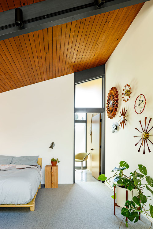
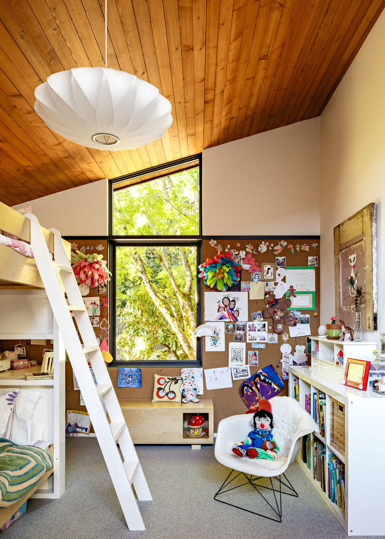
"We don't try to put our stamp on it," Helgerson says of the vintage home remodels she tends to take on, "but then I hear, 'Gosh, I can tell it's one of your projects.'" This time, the original architect might disagree.
Get the look at home
- Hire a professional. Renovating a vintage home is "tricky, and not everybody gets it," says Helgerson. "We see a lot of funny stuff."
- Hold back a bit. "Some restraint is a good thing," says Helgerson, who aims to have all the materials she's picked for a home "fit into a really small bin, and all look good together when we dump it out." Even for a really big house, "ideally the palette is consistent enough that it all looks nice."
- Embrace the space. "I advocate for letting spaces be … what they are," says Helgerson, who doesn't believe in painting a dark basement "sunny yellow" or trying to create a moody room in one that gets a ton of natural light. "Let spaces speak to you and dictate what they want to be."
Photos by Lincoln Barbour.
Related: