At Kerrie Kelly Design Labs, our clients are anything but traditional. Though transitional style prevails in our Northern California neighborhood, we're seeing more and more people gravitate toward a simple color palette, lots of great texture, and a few statement design elements.
Recently, we had a request for a fresh and feminine take on a builder home, and the outcome was the farthest thing from cookie-cutter.
The young couple who owns this home in Roseville, CA, just outside Sacramento, tossed around the idea of a simple and sweet aesthetic that mimicked their easygoing lifestyle.
The couple purchased the home in a builder community for its great location and proximity to the best schools, restaurants, and entertainment in the city. In an effort to break the mold of traditional colors and patterns often found in these suburban areas, our clients asked us to put a contemporary spin on their two-story space.
We worked with a neutral color palette to start - something to set a clean foundation that the couple can re-create and redecorate whenever they want.
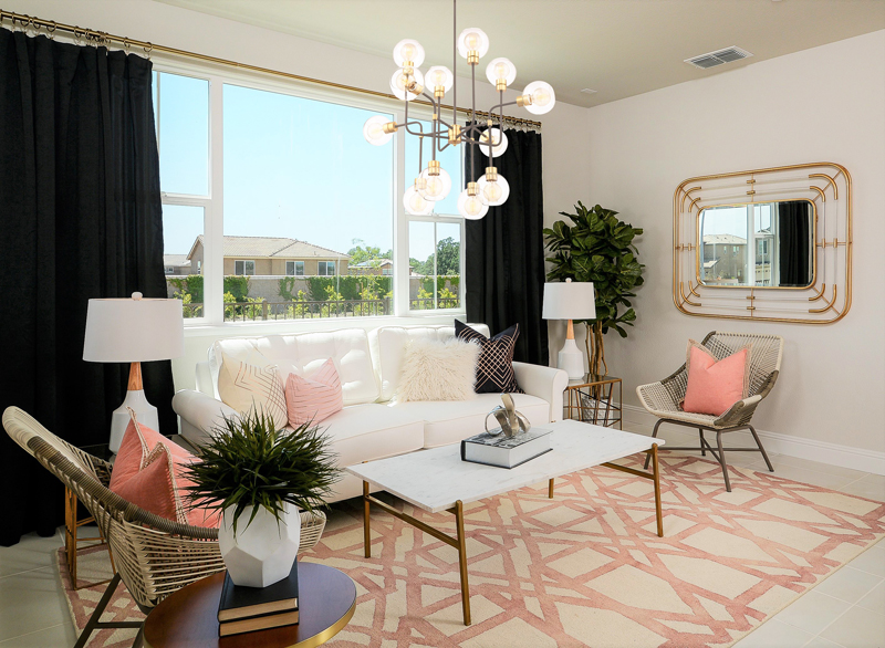
We were inspired by the couple's modern lifestyle and approach to art, colors, and prints. Our goal was to craft a space for them that echoed their eclectic style, but remained timeless for endless decor options down the road.
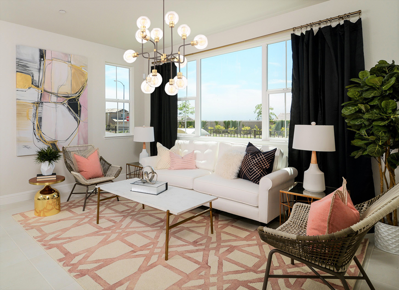
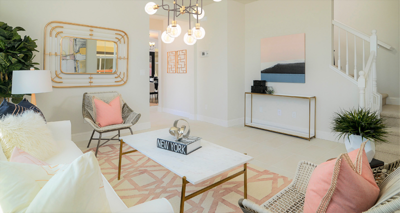
Most of the home is furnished in solid neutrals, like creamy beige with pops of metallic finishes and hardware. To add dimension, we opted for bold bursts of color and pattern in unexpected ways.
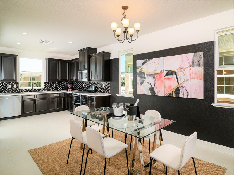
Upon entering the home, guests are greeted by a swath of pretty neutrals and feminine tones of blush and gold. But turning left, a big, bold black wall acts as the backdrop to a simply styled dining space, a testament to the couple's yearning for something a little out of the ordinary.
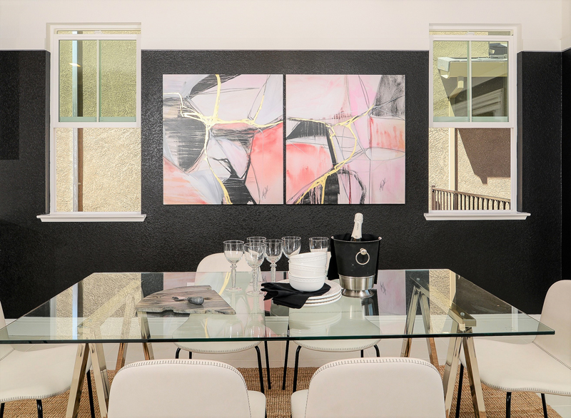
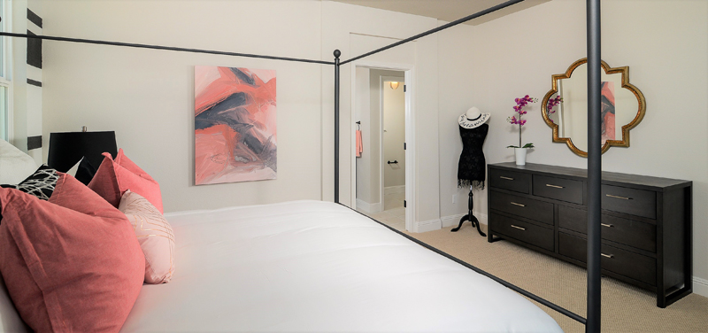
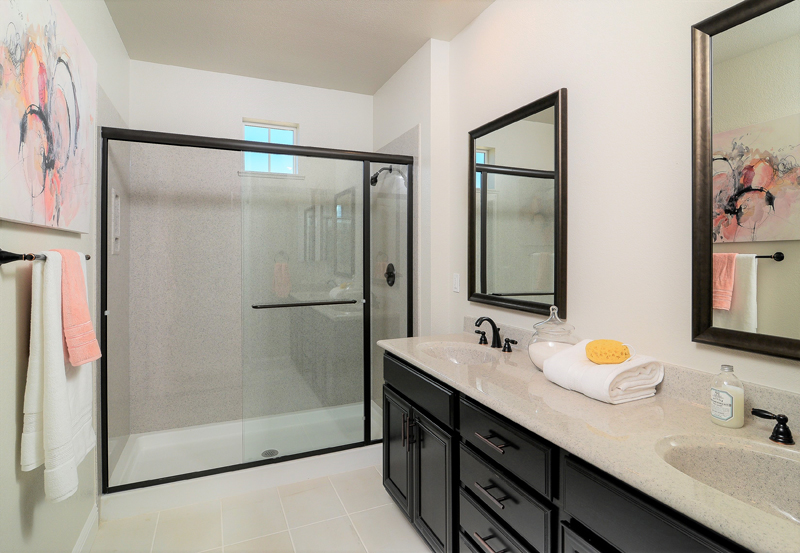
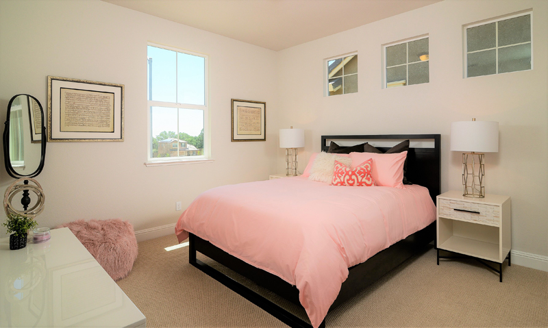
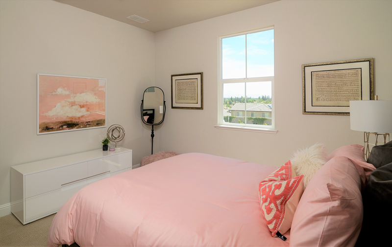
Throughout the twists and turns of the home, flashes of feminine flair prevail, such as pink throw pillows, gold-accented lamps, and abstract art featuring strokes of gold, white, and blush to tie the room scenes together.
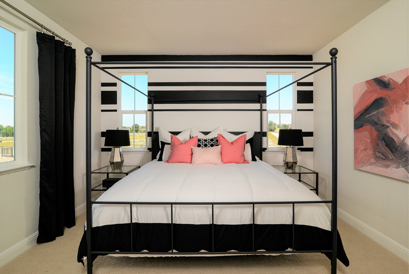
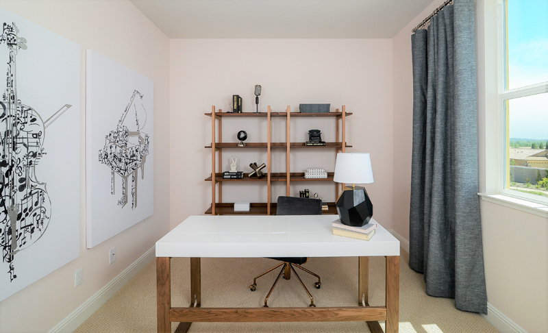
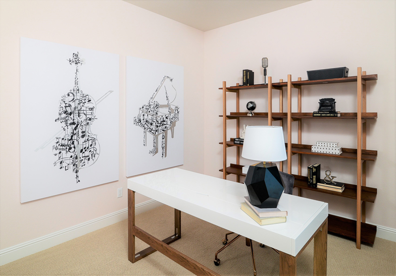
Upstairs, we painted a bold stripe on the master suite's main wall, lending a touch of detail to an otherwise cleanly decorated space. The couple's home office also remained simply styled, with clean lines via artwork and a sturdy statement desk.
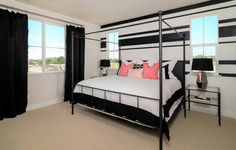
We wanted the couple to walk into their space and know they were home. Each vignette and styled corner speaks to the couple's love for art, music, color, and design. We were only too happy to create a subtle yet sweetly sophisticated home for them.
Take the full home tour:

Get the look at home
- Incorporate lots of texture. Whether through window coverings, area rugs, or throw blankets, incorporating texture is integral to re-creating this look. Just because it’s neutral doesn't mean it has to be one-dimensional!
- Create dimension with varied tones. Blush, black, and white served as our foundation for the space. To make it feel more dynamic, we sprinkled in different shades and tones of our main color to expand our palette and create a layered effect throughout the home.
- Don't be afraid to be bold. Bold doesn't have to be a brushstroke of black paint. If you only step a little outside your comfort zone and incorporate another pattern or a fun area rug, you'll instantly feel reenergized.
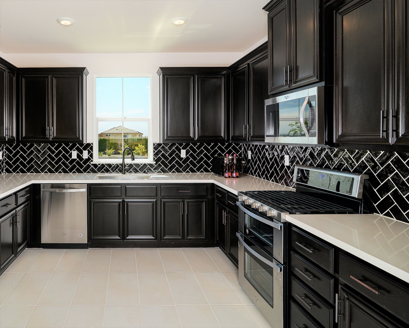
- Make it livable. Chances are you have a pet or a loved one or a family - or you actually live in your home! Incorporate technologies and materials into your space that are easy to maintain and clean. This home is chock-full of easy-to-clean fabrics, rugs, and surfaces to ensure the family spends more time enjoying their space than painstakingly cleaning it.
Related: