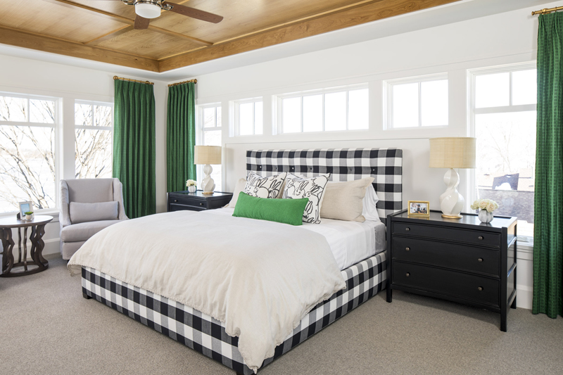
A room with a view is always inviting, but you can't overlook its interior. That's what one family learned after rebuilding a weekend getaway on the West Arm Bay of Minnesota’s Lake Minnetonka. They felt the new property lacked character, so they brought in designer Rebecca Van't Hull. Her solution: more color - and lots of it.
Situated in Shorewood Lane, about 45 minutes west of Minneapolis, the weekend home struck Van't Hull as a place where the owners could push design boundaries. The property's sizable layout and stunning lakeside views also made it ideal for entertaining.
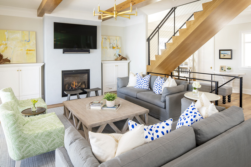
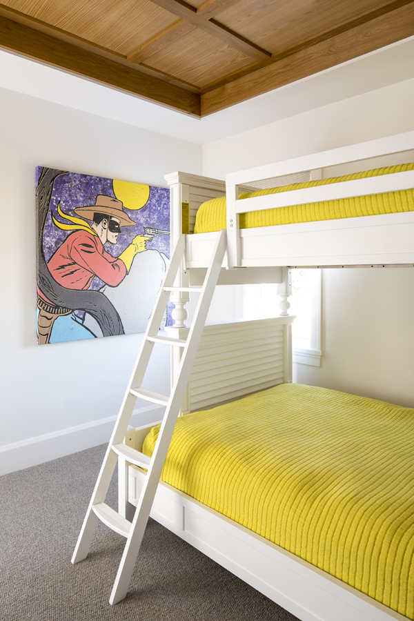
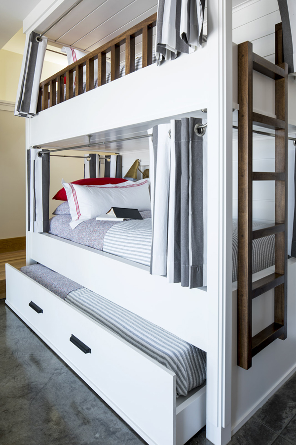
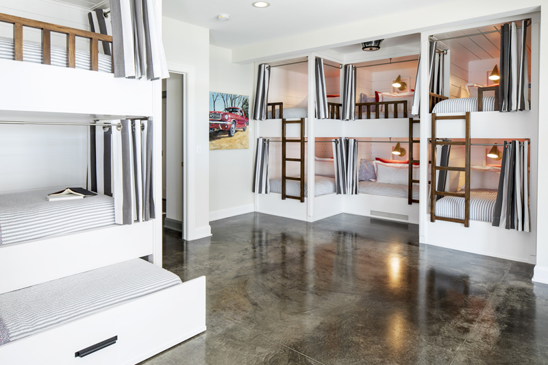
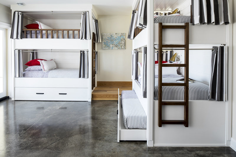
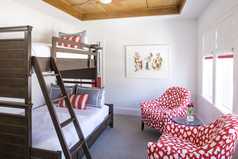
"In addition to a gorgeous master suite, the home features three bedrooms upstairs, with twin-over-full bunk beds in each, allowing up to 11 people to sleep on the top floor," says Van't Hull. "The lower level features 10 bunk beds and two trundle beds. The entire house can sleep 23 people easily."
Bright ideas
Once the family agreed on a casual and coastal look - "Minnesota lake life is all about a casual and playful environment," says Van't Hull - the designer went full throttle on color.
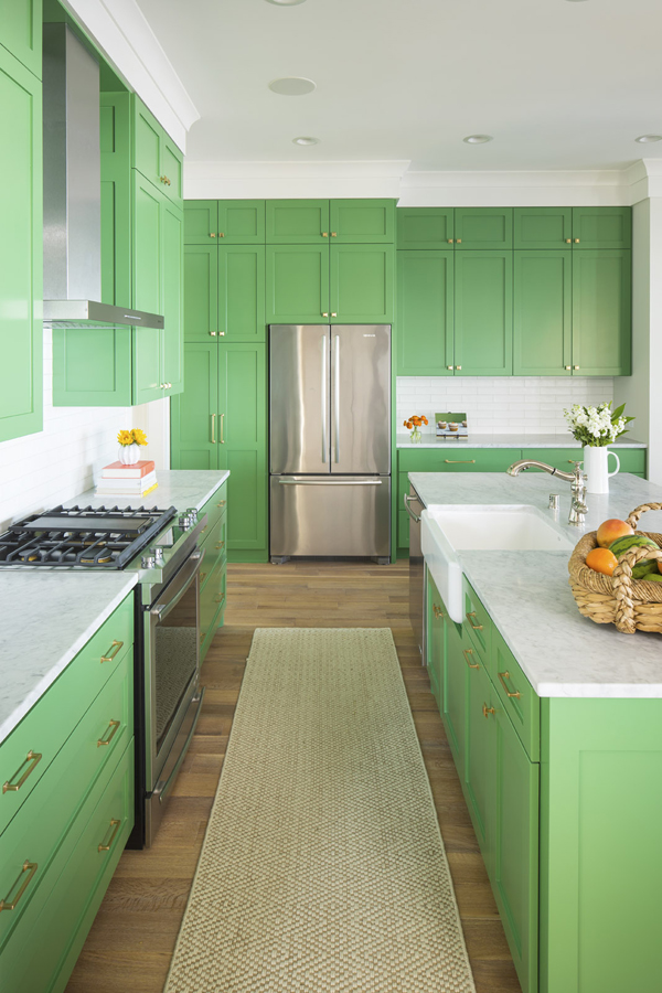
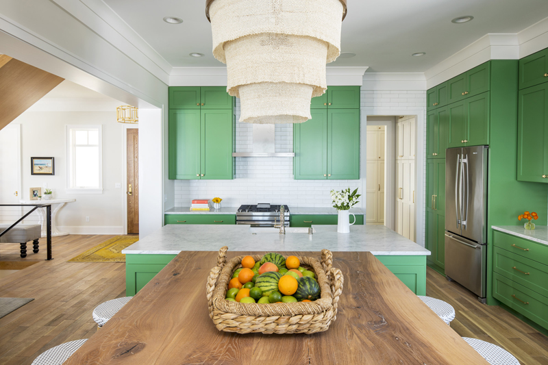
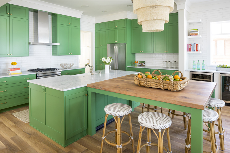
She chose Benjamin Moore's Bunker Hill Green, a muted take on the traditionally bright Kelly green, for the sleek kitchen cabinets. "It's a natural choice, especially since the kitchen wasn't the family's everyday kitchen," says the designer.
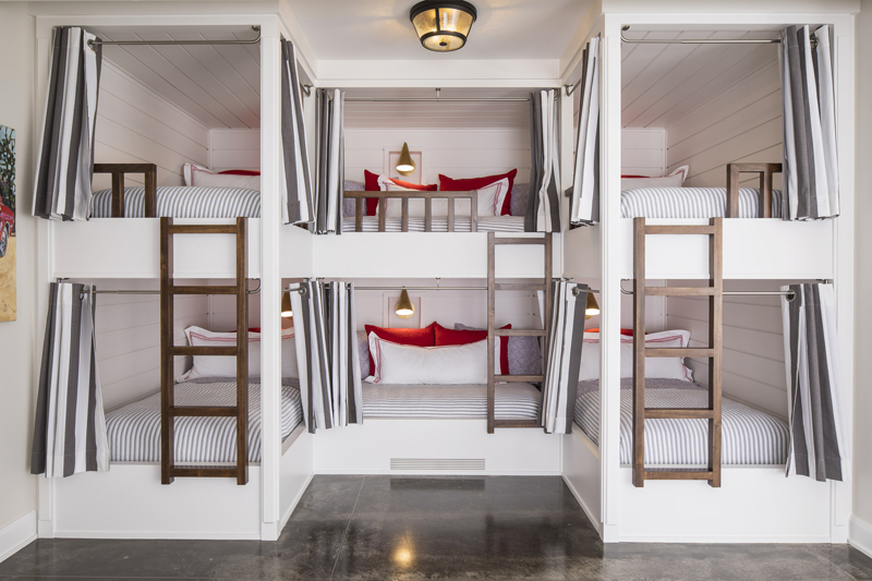
Planning the kitchen was easy, but maximizing the sleeping quarters and creating a user-friendly space that could accommodate several children at once proved to be more of a challenge. After gathering inspirational images, Van't Hull to her problem to her brother, a custom cabinet- and furniture-maker based in New Orleans.
"We worked together to finalize the design for the space, which includes a cubby inside each bed for a light fixture and room to set down a glass of water or plug in a phone," she says. The result is one of the most inviting - and incredibly stylish - bunk beds we've ever seen.
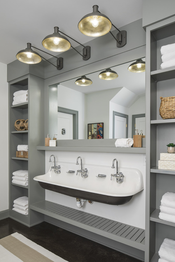
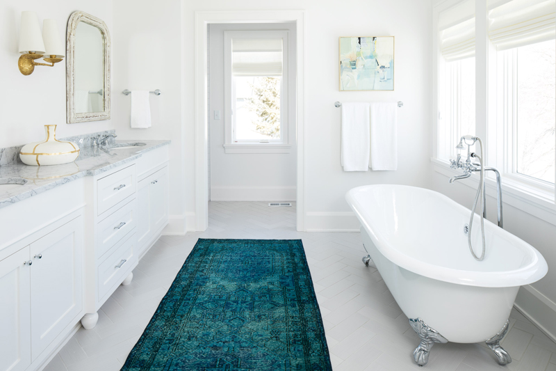
Van't Hull went similarly bold in the bathrooms, installing a trough-style sink from Kohler in one of the larger spaces, which she expects will get plenty of use in the summertime.
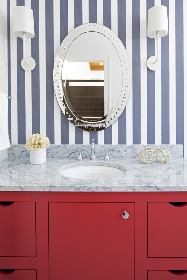
She fashioned the upstairs powder room in a "preppy Americana look," with a lipstick-red cabinet and white-and-navy striped wallpaper. With its classic white marble countertop, the cabinet feels unexpected, yet it somehow ties it all together.
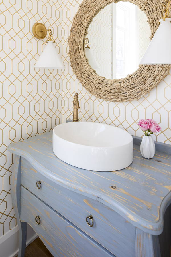
"Often good design employs an eclectic mix of things both modern and old," Van't Hull notes. In the end, she says it's all about balance.
Take the full home tour:


Get the look at home
Van't Hull shares her tips to get an eye-catching look in your own home.
- Be bold. That is, if you have the guts to follow through with your vision. "This will keep your home from looking mundane or typical," the designer says, and in the end, it will be what stands out most. Van’t Hull says one of the touches she’s most proud of is adding several vibrant rugs throughout the home.
- Get inspired. "Look for inspirational images to either emulate or share with your designer," says Van't Hull. It'll help you define your vision and better explain your goals.
- Have fun. "Acquire things that make you happy and tell a piece of your story," says Van't Hull. The Fay + Belle rug was rescued, bleached, cleaned, then overdyed in an eye-catching turquoise color. Now, the authentic accessory has a new lease on life, far from its origins in Nepal and Turkey.
See more home design inspiration on Zillow Digs.
Photos by Troy Thies Photography
Related: