In early 2011, VW Fowlkes, principal and founder of Fowlkes Studio in Washington, D.C., was struggling with a conundrum.
His clients, a husband and wife in their mid-forties, didn’t see eye to eye on the new design for their two-story, three-bedroom home in the historic Cleveland Park neighborhood.
The husband, who works in tech, "was a committed modernist who wanted everything white and super clean," says Fowlkes. And the wife, who runs a public relations firm, "wanted everything organic and sumptuous and sensual with a natural patina. So we weren't sure how to reconcile the directions we were getting."
Bold patterns, rich textures
Choosing to tackle the kitchen first, VW chose a Mediterranean-style concrete tile that had a "timeless quality to it," he says. “The graphic print was so bold, you could do nothing else to the space and it would still feel visually rich.”
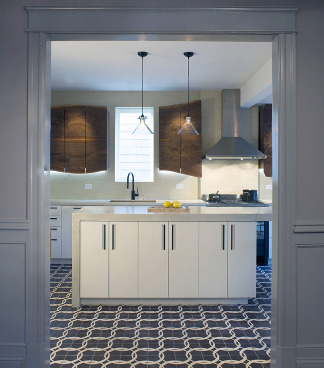
The husband saw nothing modern in it, dismissing the rope-tie print as fuddy-duddy, but in the end, the pattern won out, and the solid walnut cabinet came next.
The wife "claimed to be super picky about the kinds of grains and wood species" she liked, Fowlkes says. "She said she wanted something natural, but she didn't want it to look like a condo."
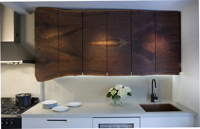
After locating a woodworker who collected trees uprooted by Hurricane Irene, Fowlkes visited the property with his client, who walked around and chose the walnut tree of her choice for the cabinet.
The Maryland-based woodworker placed the wood in a drying kiln for four months so it wouldn’t warp, cup, or check while crafting the cabinets. Fowlkes also reinforced the back of the slab with steel rods for additional protection against curling.
"It's clean and modern, but it's also very sensual," Fowlkes says of the cabinets, which feature a live edge on the bottom that reflects the tree's shape. "We wanted to really express the nature of the material we were using. You can see some marks from the chainsaw at the edge where it was cut."
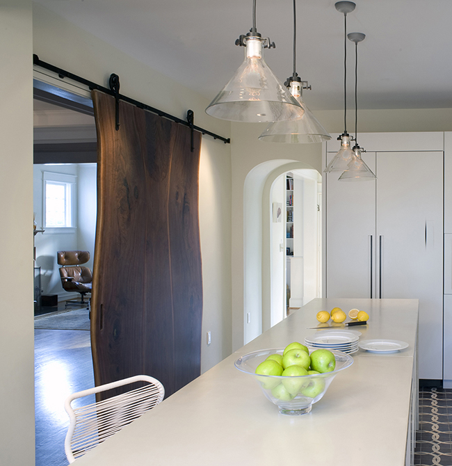
The same woodworker provided the materials for the kitchen's window seat and sliding barn door. The light pendants, made by Sundance Company, were chosen for their transparency, since they wouldn't block the view of the cabinets from the dining room. "They're not overly or self-consciously modern," Fowlkes says, adding that they were hardly expensive.
Spacious room, warm accents
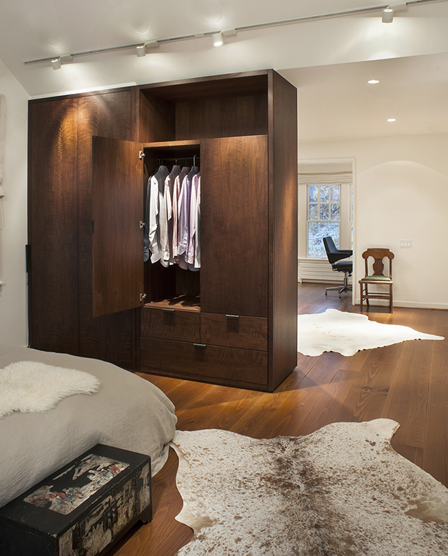
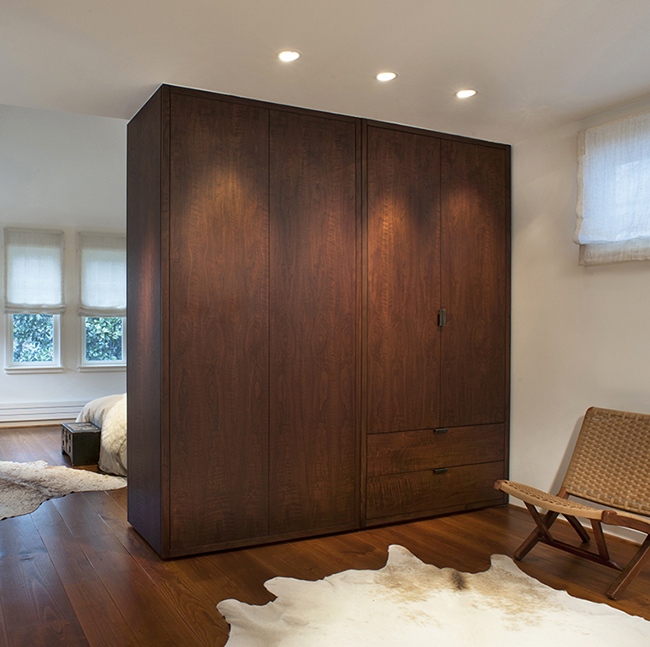
Upstairs, Fowlkes converted the tiny three bedrooms into a single master suite, which features the same walnut millwork and custom bronze hardware as the kitchen. In the closet, a little bronze hook pulls out for hanging up clothes, and the wide-plank pine floors lend warmth to the airy, white space.
Nature meets modern
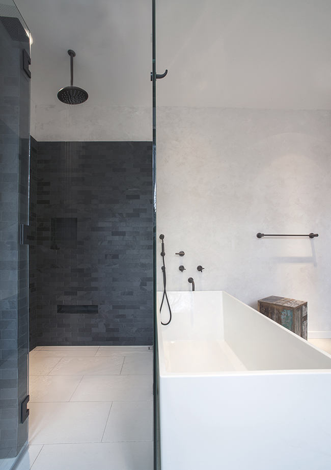
For the bathroom, Fowlkes sourced a porcelain-style floor from Architectural Ceramics that resembles a concrete material. The bathtub and raised sinks are from Montreal-based company WETSTYLE. As with the kitchen, the plumbing fixtures have a living bronze finish that appealed to the wife's interest in nature.
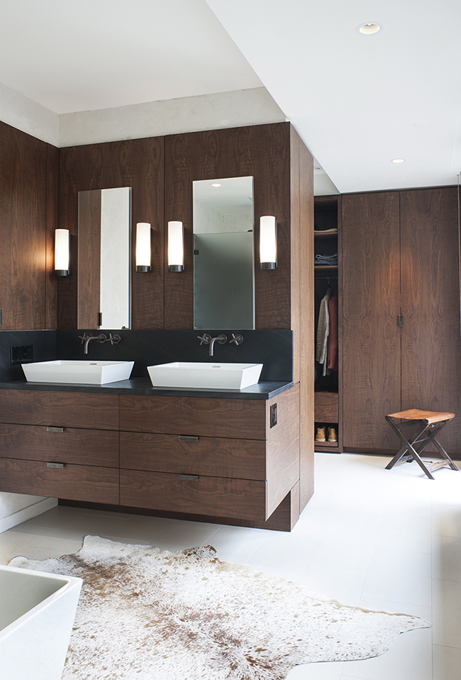
"We wanted it to feel like the whole room was a white box, and we brought in the vanity and closets almost like we'd bring in a Steinway or your grandmother's Chippendale," Fowlkes says. "They weren’t necessarily things that had always existed in the house - they’re more like furniture."
Get the look at home
Fowlkes explains how to achieve a streamlined look in your own home.
- Protect the wood. "The trick with using slabs of solid wood is to keep it from warping or cupping," he says. "It needs to be very dry. Our slabs were in a kiln for several months." Another tip: Make sure your hinges are sturdy enough to handle the extra-thick doors.
- Spend wisely. Of course you want to love your home, but you don't have to break the bank for every doorknob, drawer pull, or faucet. Noting the Brazilian slate tile in the wall of the shower, Fowlkes says, "You can use simple materials, and you can find things that'll look great and kind of recede that are inexpensive."
- Hide the cable box. This is a common mistake that many homeowners make, Fowlkes says. "We forgot about them, and we had to go back and figure it out after the fact." Not fun.
Related: