Choosing colors for your home can be overwhelming. From neutrals to bold accent colors, the shades and intensities of each color can be confusing, especially after staring at a few hundred paint swatches.
To help you avoid common color mistakes (or fix them if they happen), we compiled a few rules to live by when it comes to selecting your colors and applying them to your home.
Neutrals are essential
No matter what anyone says, white is always an option. If your style is Spanish revival, colonial, Arts and Crafts, or mid-century modern, you can always use white and other neutral colors to balance heavier tones. Or use them as the star of the show, and create a clean backdrop for your favorite accents and pops of color.
White is the most popular of the true neutrals, but even white has variations of shade and subtlety. It's a standard backdrop for contemporary interiors, but it also adds cleanliness to traditional design and stability to more eclectic looks.
The mistake: No neutrals in the home.
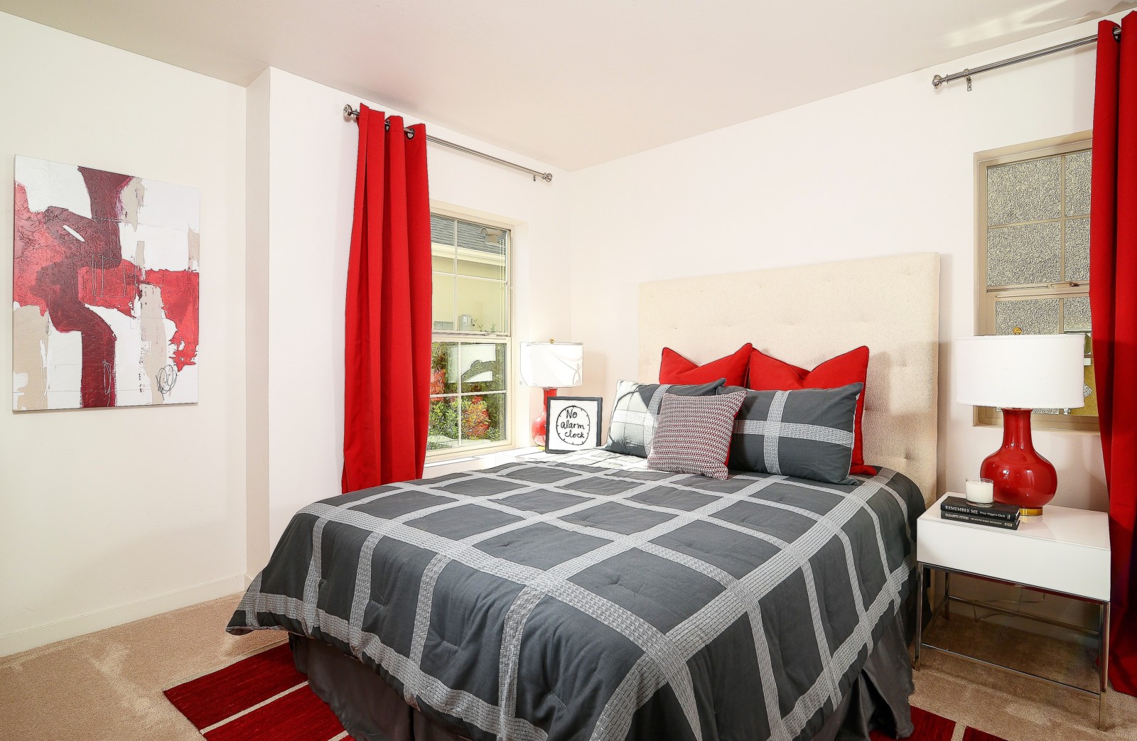
How to fix it: If your home is splashed with colors that are deep, dark, and seemingly irreparable, you have a couple of choices. You can paint and paint and paint to get a clean white that works with any interior style, or you can go even darker with the mother of all neutrals: black.
Black brings drama and definition to all elements of a space and anchors any design. If you don't want to add stark black, consider charcoal or versions of gray - they provide similar results to black without the intensity.
Combining colors doesn't have to be scary
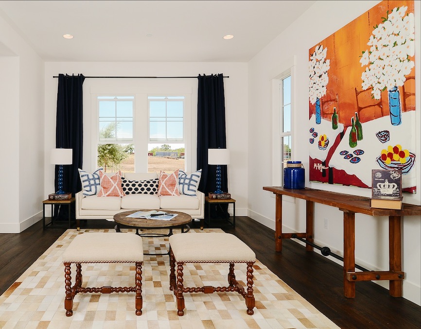
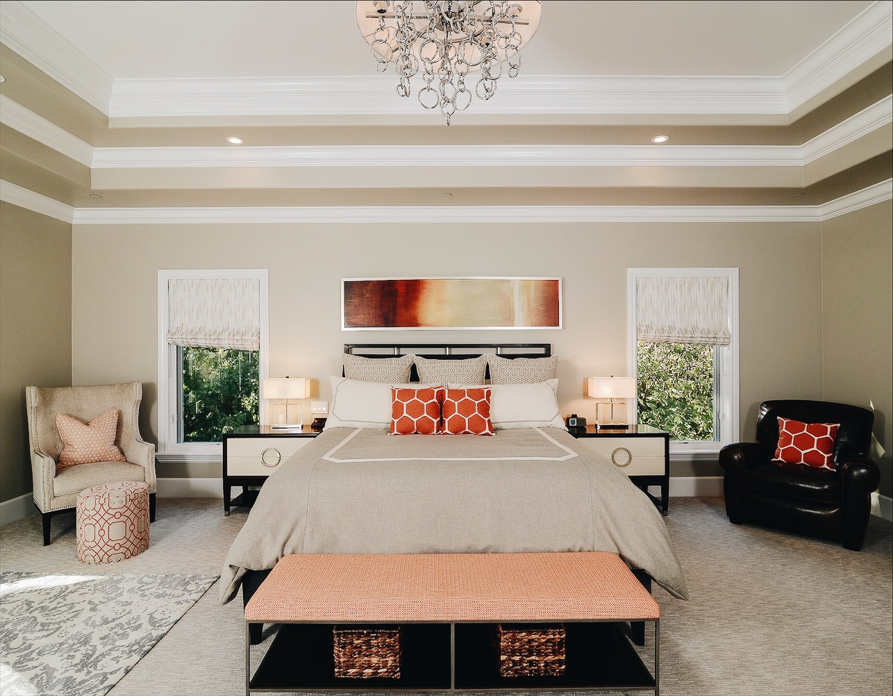
Individual colors are interesting, but the real design fun happens when you bring colors together in a room. Endless color combinations are possible, but it's important to keep a few things in mind.
First, keep the color intensity similar. A room would be boring if all its colors were the same intensity, but they should still work together. To prevent one color from overpowering the other, keep them within the same range of brightness - the color combinations shouldn't be too much lighter or darker than their counterparts.
Next, be aware of undertones. Your colors will be harmonious if they have the same undertone. Also, use unequal opportunities and think about the placement of each color. Equal amounts of color fight for attention, whereas a star color and supporting accent color make much more sense.
When deciding where to put each color, think about its visual impact. Where you place your colors in a room is just as important as the proportion of their representation.
The mistake: Too many colors in too many tones.
How to fix: The easiest way to fix a color overload is to start editing. First, subtract the complex colors that challenge the room's design.
Next, edit how often the color makes an appearance. Finally, consider rearranging the colors’ locations. A few edits to a colorful space can make it much easier on the eyes.
Color affects light and space
When selecting a color, don't just consider how your furniture will look with it - consider how light and space will affect it, too. While most light in the home is artificial, natural light still plays an important role. The way materials and surfaces reflect light also affects color.
You can also use colors to alter the perception of space within a room. Generally, light gives the illusion of more space, while warmer colors make the space feel smaller. This is when color is really useful - painting an end wall in a long, narrow room a warm, dark color will help the space feel more evenly proportioned. On the other hand, the same paint color in every room will give your home an even visual flow.
The mistake: The colors you chose don't play well with your home's lighting and spacing.
How to fix it: Between a room’s scale and how colors reflect light, certain colors can look stronger once they’re in your home. If you selected colors that aren't playing well with your home's lighting and spacing, you have a few options.
First, go for a solid neutral. White and light-gray paint create a visual flow, brighten dark areas, and build on the airiness of more spacious rooms.
Next, add contrast and interest by painting the trim a different color or by adding wainscoting or moldings. These architectural details break up heavy paint colors, and add texture and dimension.
For more design inspiration, check out Zillow Digs.
Top photo from Zillow listing
Related:
- 3 Color Palettes for a Sophisticated Home
- Creative Ways to Add Color to Your Rental
- The Un-Boring All-White Kitchen
;)